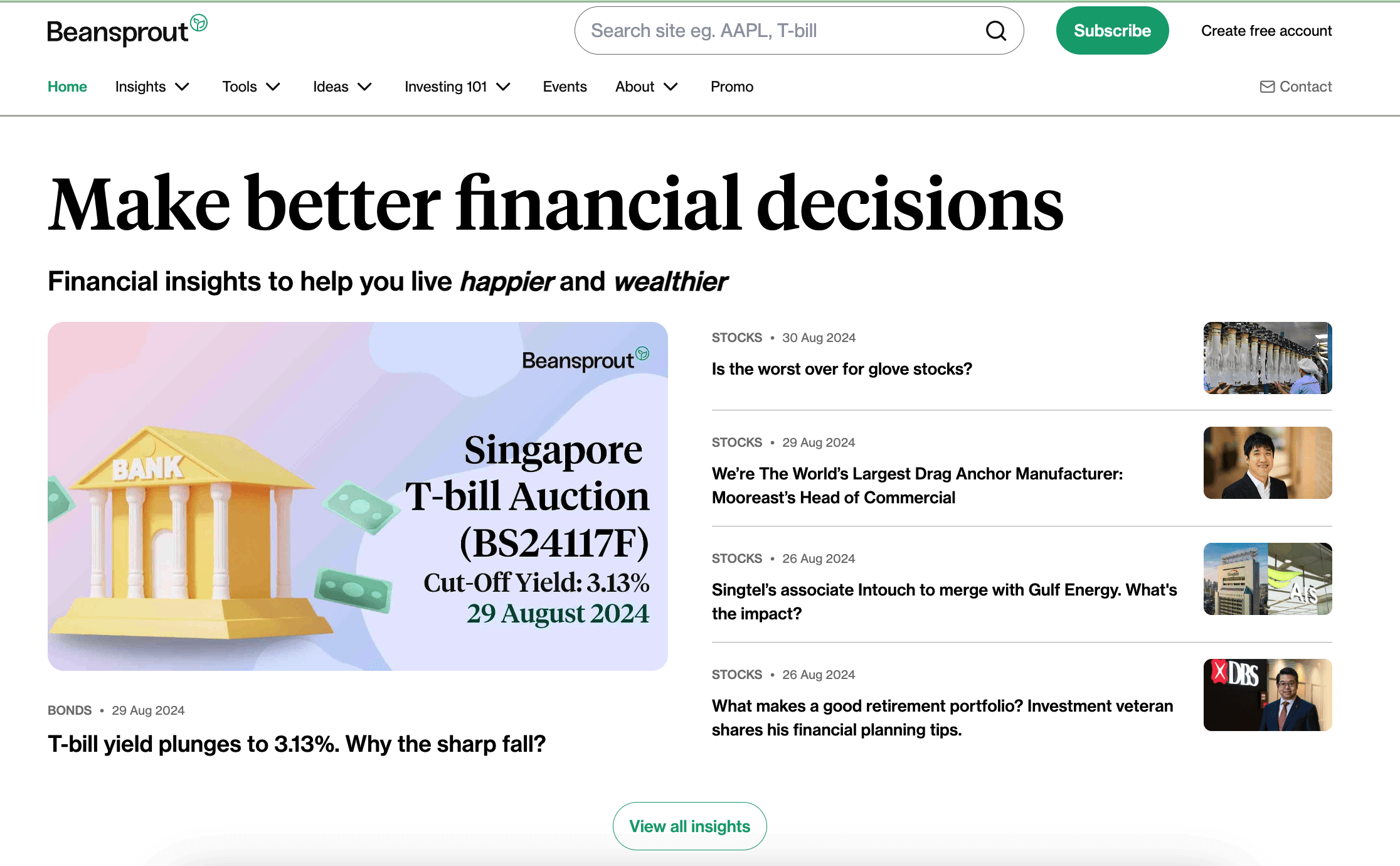
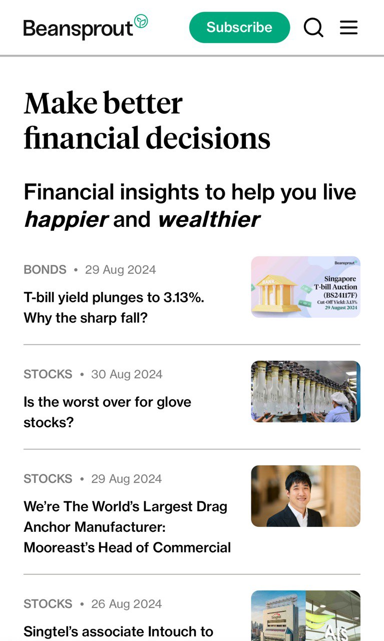
Beansprout Responsive Web Design
Scaled a financial advisory website from 0 to 150k monthly unique visitors
My Role
I am the sole product designer who is in charge of the end-to-end design process to help create a responsive web app that has achieved over 150k unique users.
Method
User research, design systems, wireframing, prototyping and usability testing
Platform
Web and mobile
Table of Content
Overview
Beansprout is a financial advisory technology startup on a mission to empower retail investors to achieve financial wellness. I am the sole product designer that is in charge of the end-to-end design process to help create a responsive web app that has achieved 100k unique users.
Beansprout was initially developing a mobile app that faced delays in approval resulting in barriers to access for users. Beansprout needed to start driving content to users to gain brand awareness and enable monetization.
Outcome
🎉 The current web app development is still ongoing and now reaches over 100k users monthly
01
Top 50 most-visited investing sites in Singapore
02
Achieve over 100k unique users in a month
03
> 1 million views within a month
Feedback from the community
Found the design to be clean and intuitive so I sign up for an account
It's perfect. Actually such calculators are really useful! Thank u so much for helping us.
I like the story behind Beansprout and the way it is structured. I look at some articles on accounts and Tbills which are hot topics in Singapore. The design is clean and intuitive, colors are attractive, weekly newsletter is easy to see which make me sign up.
Problem
Beansprout had been spending months developing a native app and was having a hard time getting app store approval. There were two main problems that Beansprout was facing prior to launch:
01
Barriers to access
The app store approval for the mobile app took a long time to approve. We had to go back and forth to make minor changes to the UI design based on iOS requirements.
02
Limited funding and lack of brand awareness
The limited funding for Beansprout meant that it needed to find ways to monetise or quickly bring products to market in order to be able to monetise them. Through research, we found out that financial products need to come from credible sources.
Beansprout lacked a mobile-responsive platform that users can easily access without having to download the mobile app
Business Goals
Beansprout needed a solution to resolve the problems faced to meet the following business goals:
01
Drive reach to enable monetization
We want to reach out to as many people as possible with actionable insights so we can start working with partners and work toward monetization
02
Drive Beansprout brand awareness and site visits
Users also shared that they trust insights from more well-known and reputable brands. We also wanted to start tracking web analytics which required us to have an increase in site traffic.
Solution
As web apps do not require app store approval, we pivoted our focus to enable us to launch the product and content quickly. I work closely with Beansprout’s founder, technical lead engineer, and product managers to develop a mobile responsive web app that users can easily access on the go.
Over 70% of the existing financial insights platform are mobile device users, we need to ensure the web app is mobile-optimised.
The current solution includes these 3 main features:
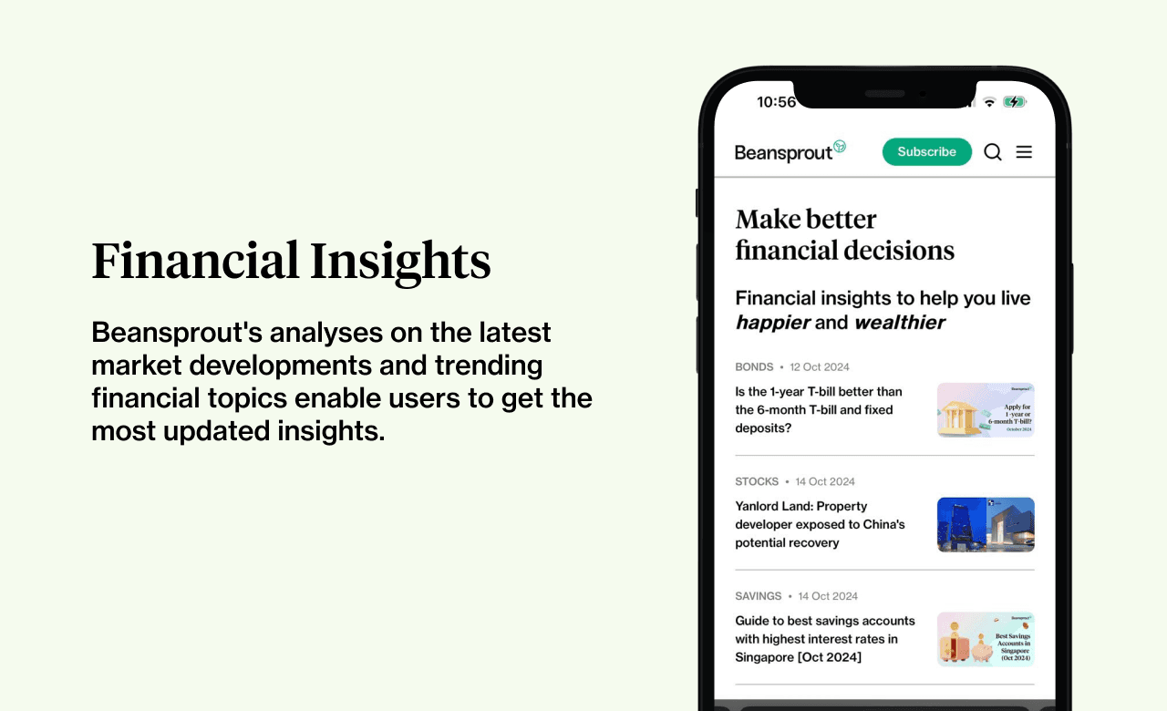
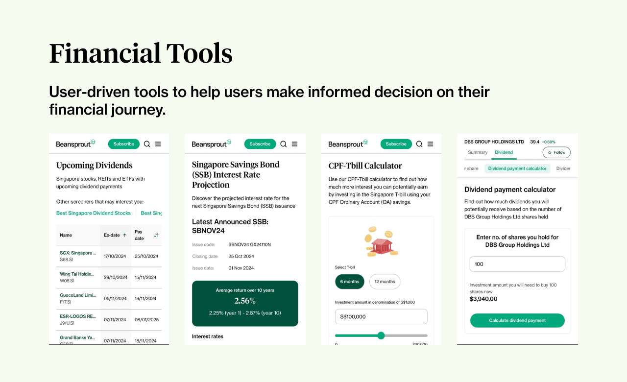
A mobile-responsive web app that users can easily access to build trust in Beansprout's financial insights. With its current reach, Beansprout is able to monetize and continue to develop products like financial tools, creating value for users through a continuous feedback loop via the Telegram community.
Research & Design
The first step in creating the responsive web app was to set up the design system and start sketching and wire-framing to promptly establish testable content. This quick start allowed us to test the content. The initial structure of the website was shaped by the early user research findings which was focused on providing insights to users who wanted:
simplified and relevant market news and research report
consolidated information on a single platform
Following the initial testing, we engaged in further refinement of our features through additional user research. We realized that our target audience does not align with the users currently on our platform, which prompted us to revisit our user interviews for further analysis
User Research
The initial user persona from early user research indicated that users lacks time to do stock investment research despite finding it important to gain the confidence on their investment journey.
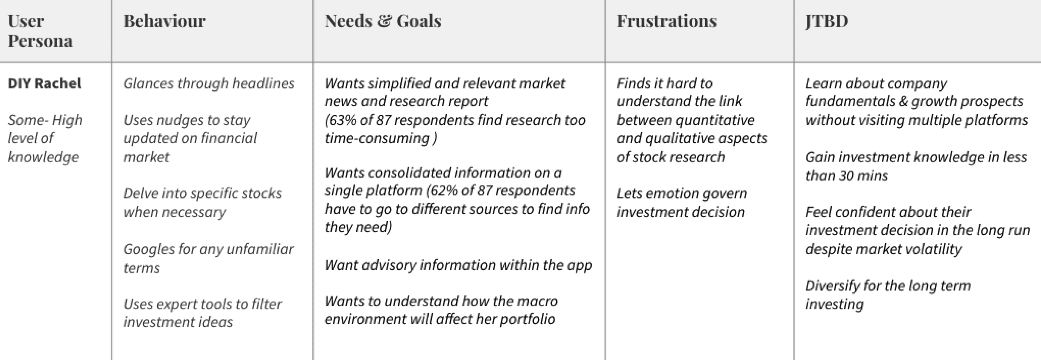
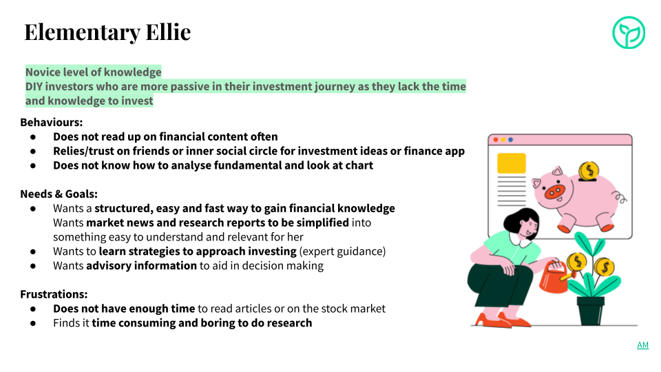
As we continue to monitor site traffic, we realised that not many users are using the stock research provided and started questioning our initial persona. Diving back to the affinity mapping on the user feedback and research, we found similarities and identified two main user personas. They are both retail investors that have interest in investing but are at different level of knowledge in investing:
Elementary Ellie who is a beginner investor and lacks knowledge and time to improve on financial knowledge
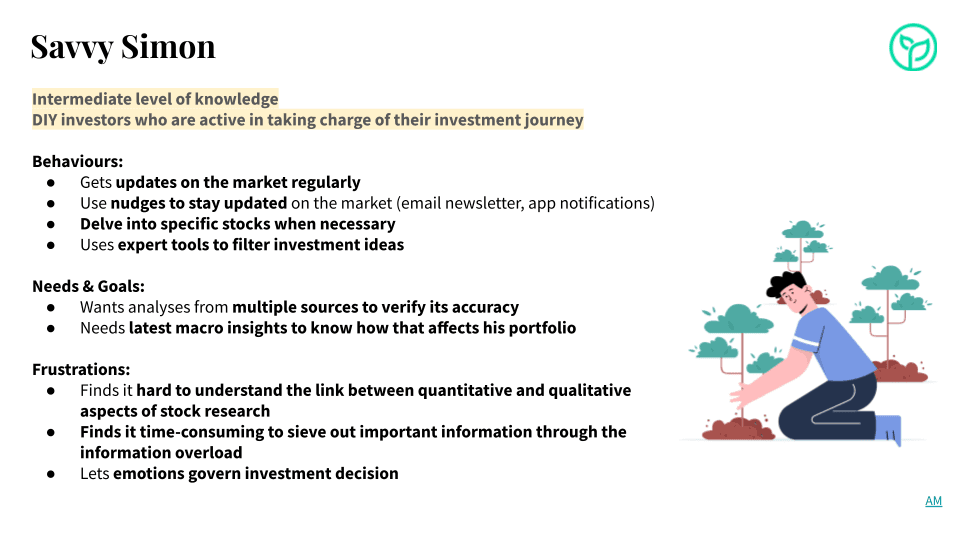
Savvy Simon who is an intermediate investor that is more active and will spend time to get regular updates on the financial market
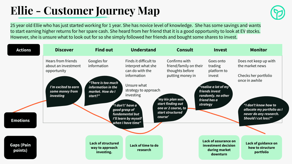
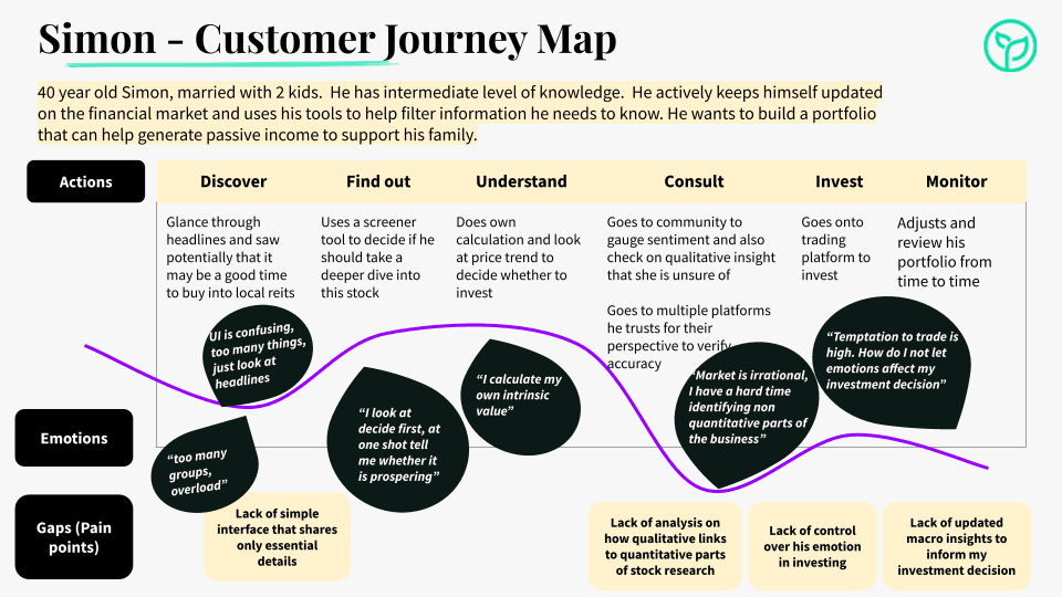
I reviewed the raw data from user interviews to gain additional context and incorporated direct quotes to draft an initial user journey. This journey is based on some assumptions, aiming to help us identify gaps and better understand how we can address their pain points.
Design System
A structured design system was needed. The previously created components were designed exclusively for the mobile app, with no components developed for the website. My first step in building the web app was to recreate the design system, ensuring alignment and consistency across both mobile and desktop. Since then, it has been revised based on additional feedback and user testing.
Designing for accessibility
Changing of primary colour to #00A87D, and changing ticker colours to #00873c and #EB0F29. The initial brand colour did not meet accessibility requirements. We use the same green and adjusted the contrast colour so that it passes the web content accessibility guidelines (AA) for the interface graphic.

Following Tailwind CSS guidelines
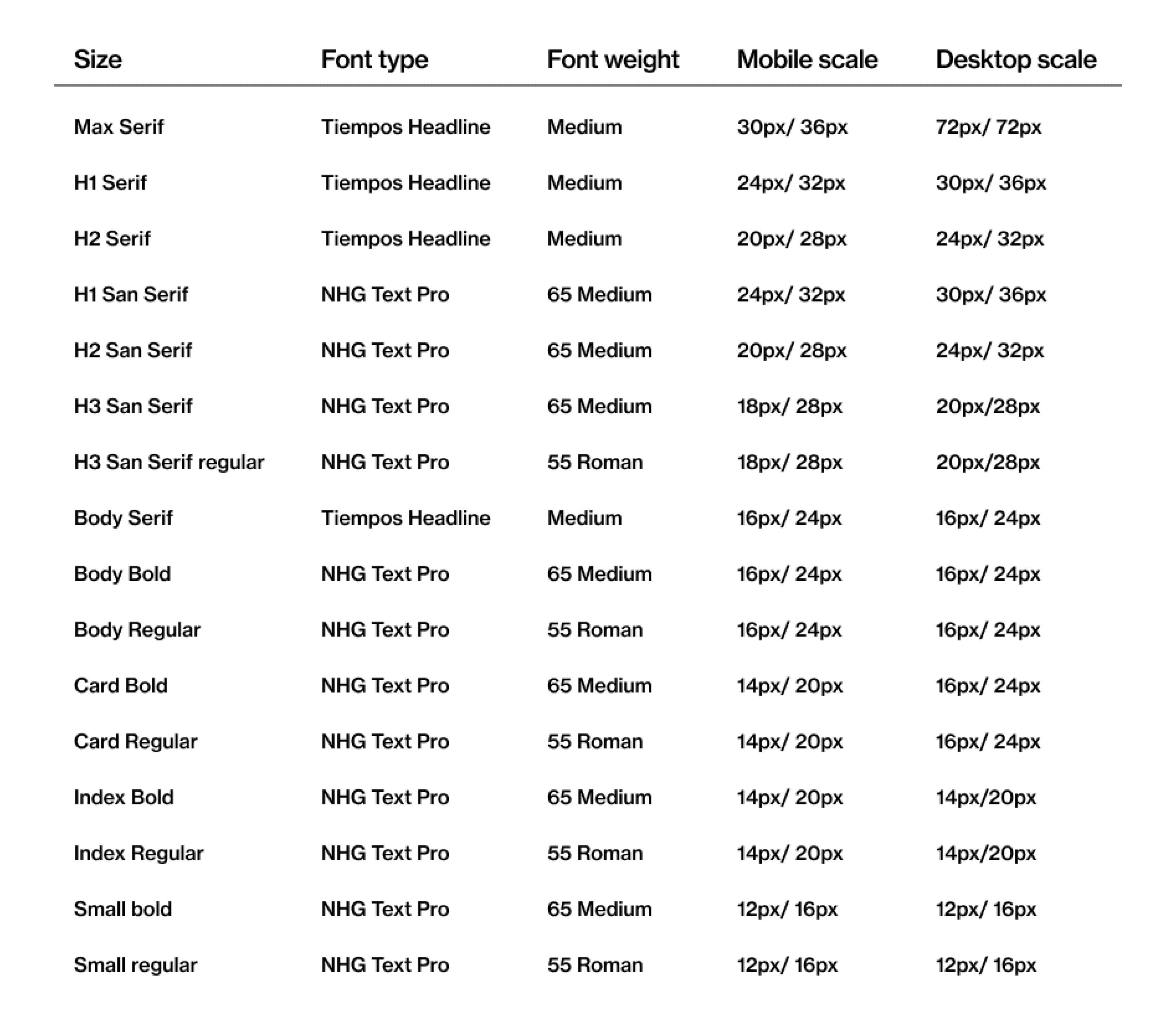
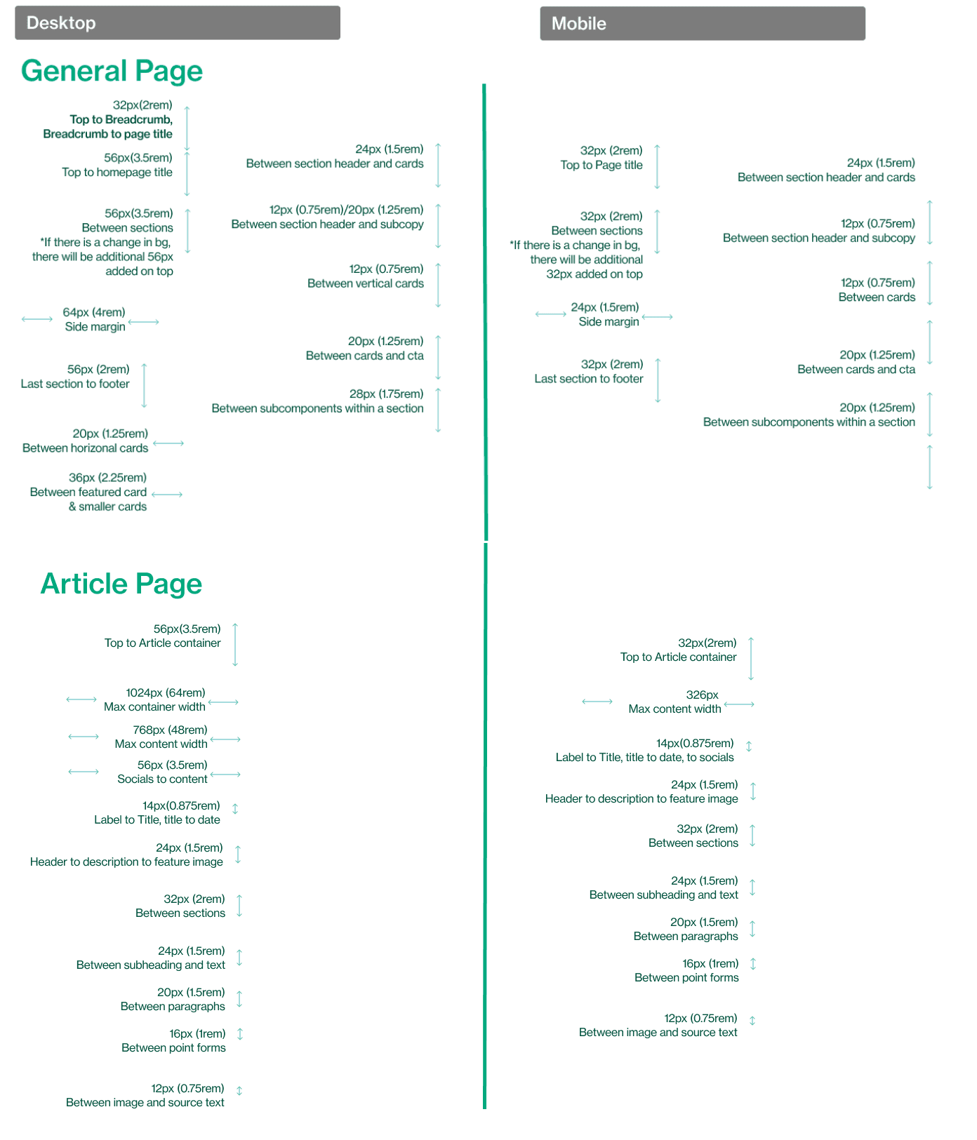
To make components and font sizes consistent throughout the different screens, I had to ensure both mobile and desktop sizes were properly defined. Due to limited time, I used guidelines from Tailwind CSS to help define the recommended font size scale to quickly define the various font sizes used so tech team can align on one single source of truth.
Reducing article card sizes on the website
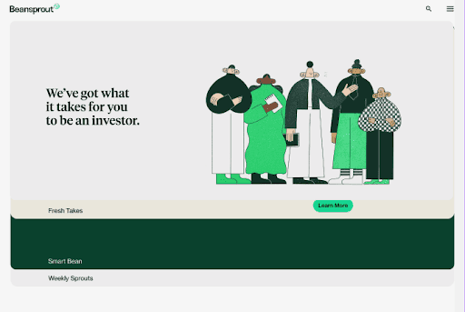
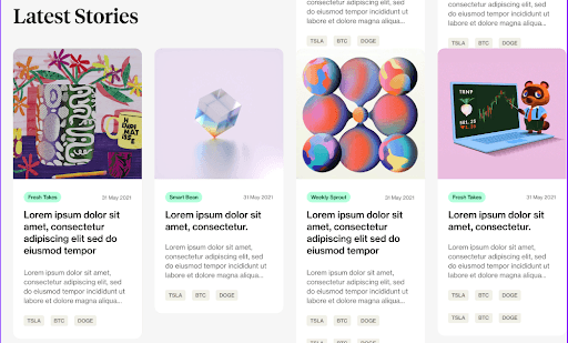
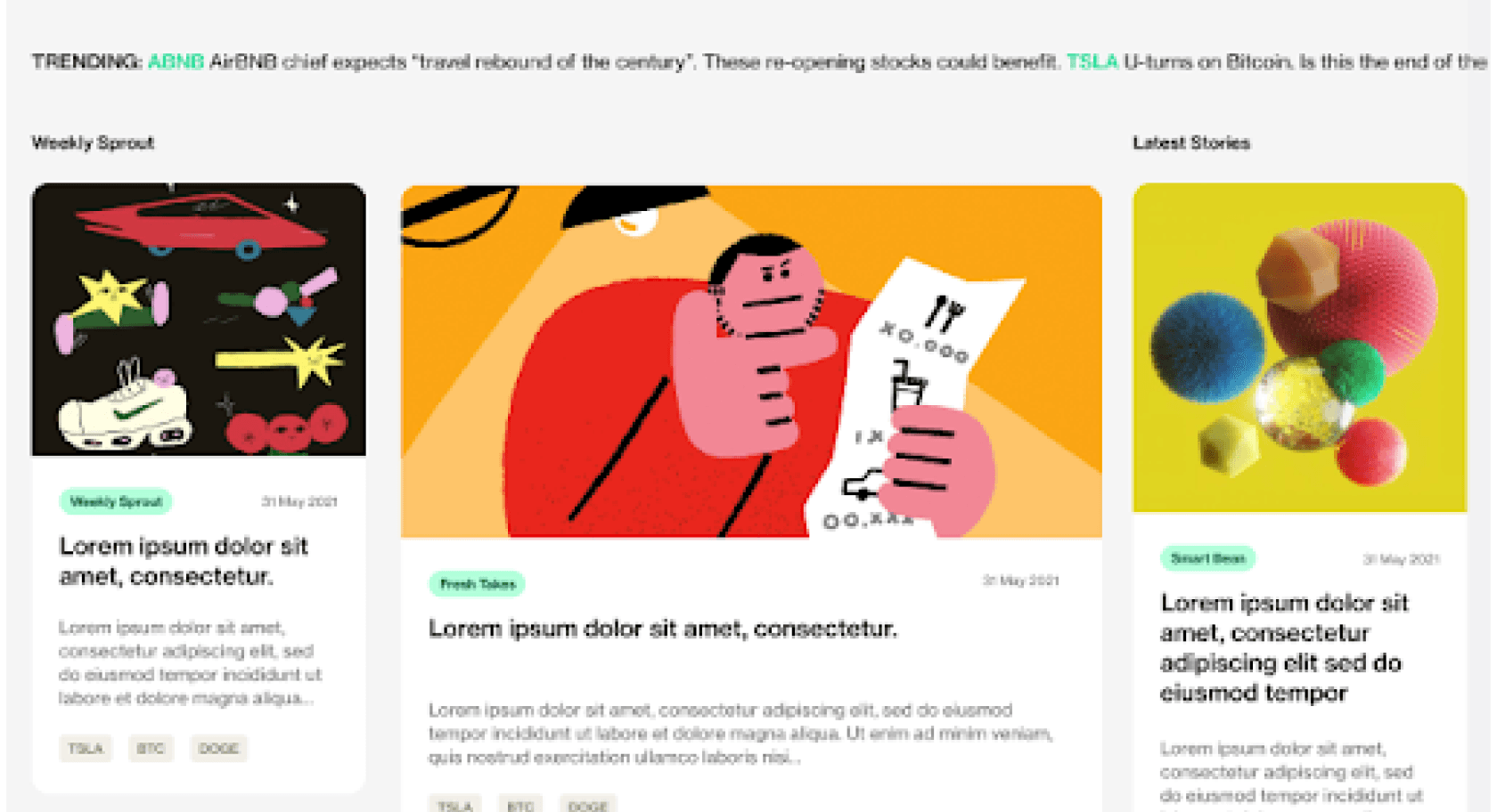
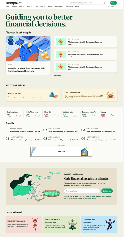
Firstly, we needed the design to be mobile responsive. the initial cards were aesthetically pleasing but had very large article card sizes that make them hard to scan through for investors who lack the time to get timely market updates.
Before
After
Wireframing & Prototyping
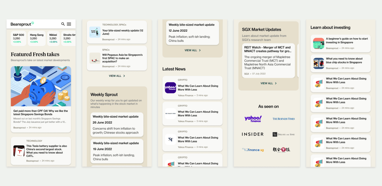
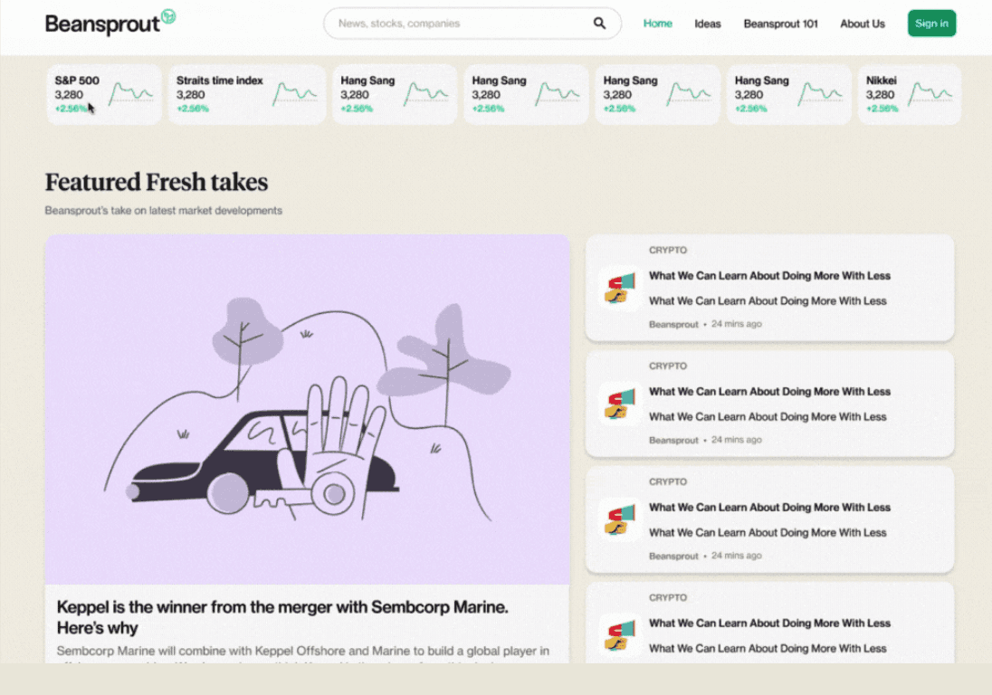
Time was a constraint so I went ahead with some sketches and proceeded with high-fidelity wireframes for testing. The key thing was to build up more content on the platform and gain exposure first before we use card sorting to determine the website’s IA.
Home
Ideas: Fresh takes & News
Beansprout 101
About us
User Testing
Each round of user testing was conducted with five participants and due to the low traffic at the beginning, we used improvements in SUS to measure the impact of the design. SUS scores improved for consecutive 3 rounds of testing from the start of the mobile responsive web app redesign to usability test 11 with minor UI and content adjustments.

Major Design Iteration & Feedback
We conducted a series of testing and iterations as the website evolved due to various needs. Below are 3 of the many design iterations that we have done to make the site more impactful:
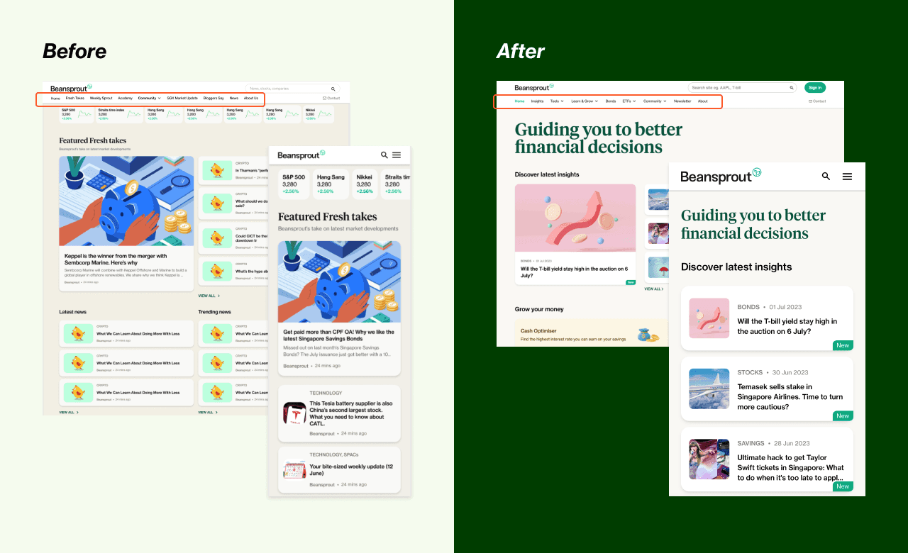
Iteration 1: Users want the most updated exclusive platform content when they get onto the platform
Users do not actively go onto a financial platform to read the content they can get elsewhere. We reduce the clutter on the site to remove news and financial blog content to focus on Beansprout’s exclusive content. When browsing, users mainly care about the latest or trending insights.
Iteration 2: Improve the position of related articles to improve the bounce rate
During user testing, most users stopped scrolling when they reached author section. The related section displayed article cards below the author section make them less discoverable. Related articles currently contributes about 40% of the clicks from the article pages.

Before

After
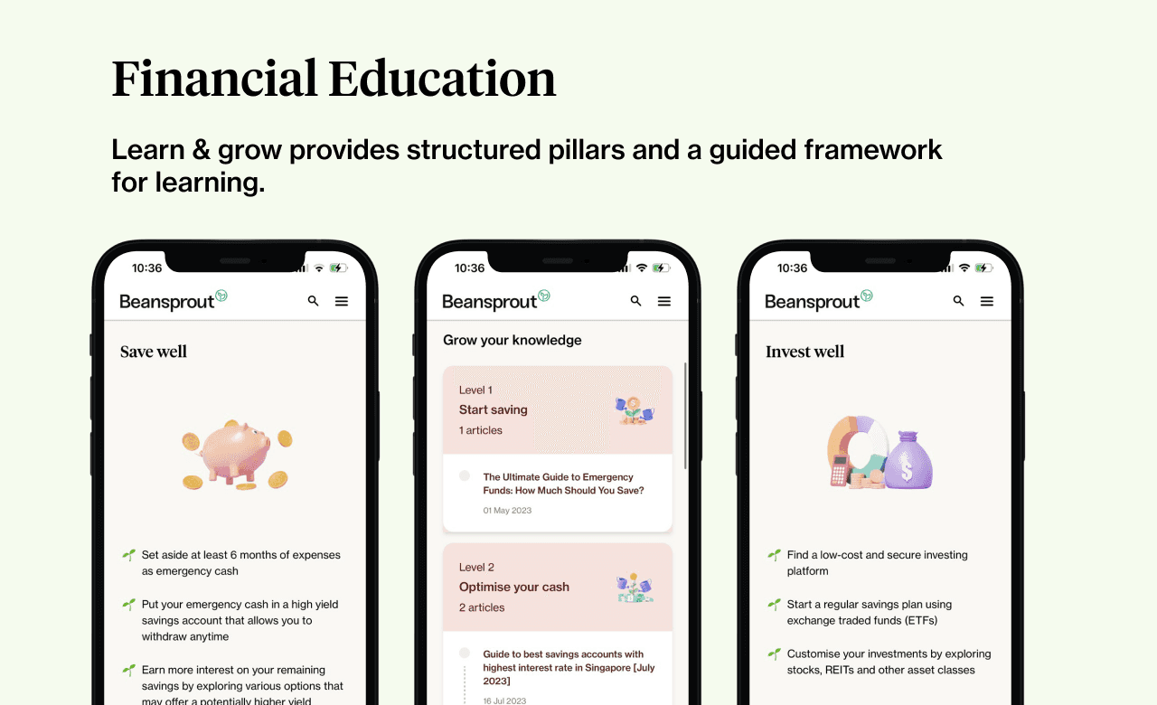
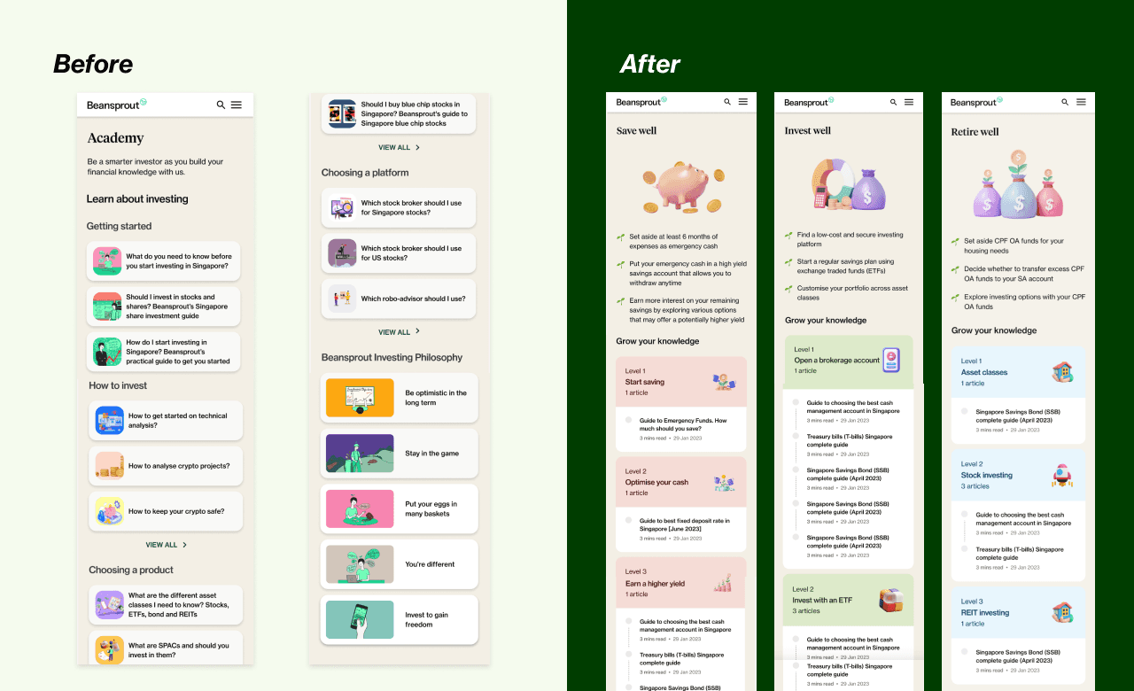
Iteration 3: Provide a guided framework to help beginner investors get started on their financial journey
Users felt that the articles shown under “Learn about investing” seem to be random and lacks overall guide. Beginners shared that the hardest is to get started and having a structure helps with learning
We restructured the Financial education section to provide 3 main pillars - Save well, Invest well and Retire Well, to guide users through various stages of their financial journey. We also provided levels within each pillar to show progression in their learning.
Positive feedback from Beansprout community members
The information is so well structured- esp the learn and grow section. A lot of the other sites are overwhelming and this is really easy to navigate! I’m using the resources for my investing plan
Final Design
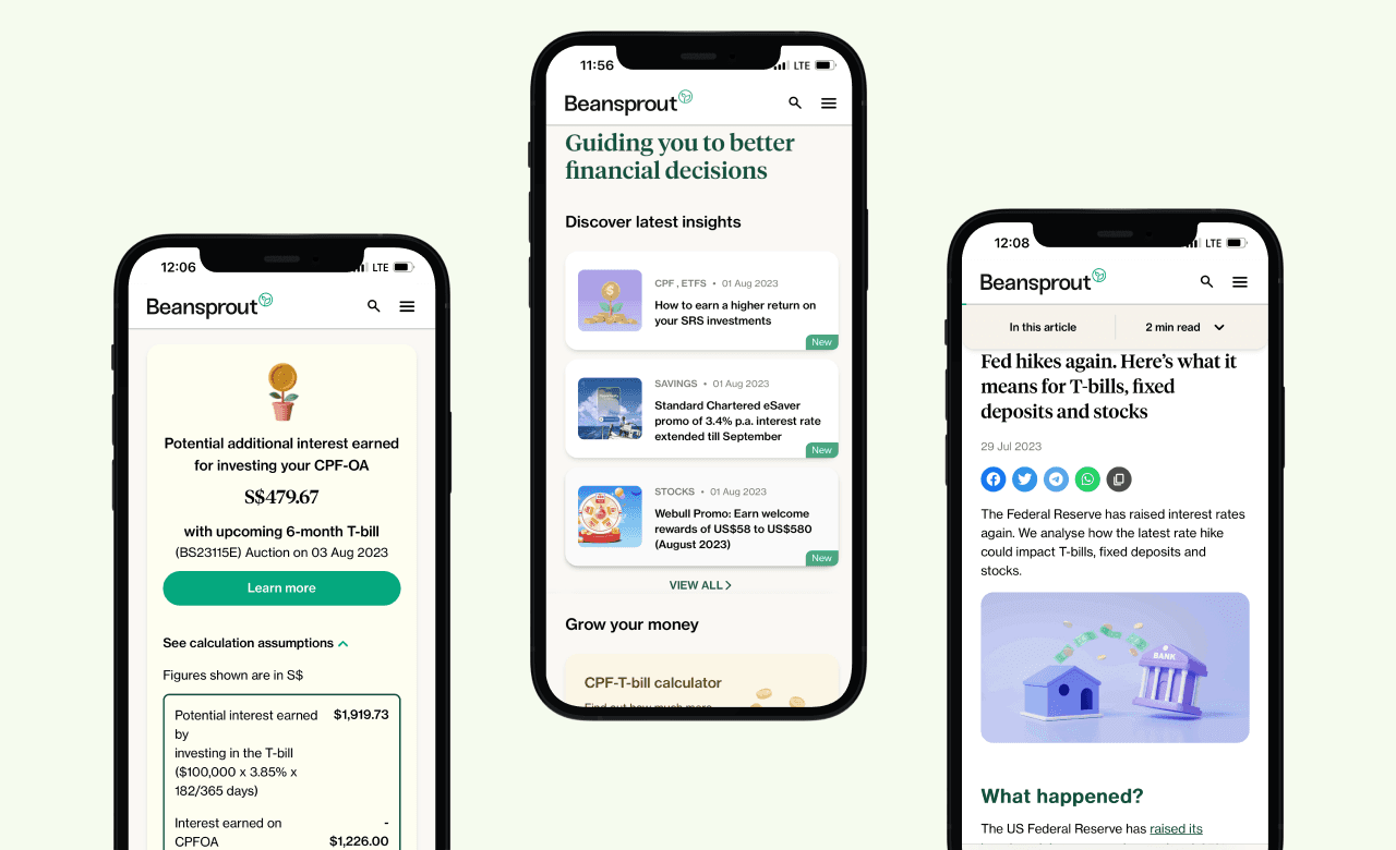
Current design has also been through multiple iterations based on business requirements and user needs. Stay tuned to upcoming case studies for more details.
➡️ Visit the current design on growbeansprout.com
Learnings
Personal Growth in UI
As a career transitioner without a visual design background, I initially grappled with self-doubt when I took on the responsibility of redesigning the user interface from the ground up. However, by tapping into the diverse perspectives of my team, incorporating user feedback, and integrating stakeholder input, we successfully delivered our initial solutions within three weeks.
The initial design, created by an external agency, was visually stunning but lacked the necessary accessibility features to ensure an optimal reading experience for all users on the platform. It became clear to me the importance of considering every aspect of design, particularly the critical need for accessibility.
Measuring the Impact of Design Iteration
Initially, we lacked a systematic approach to measure the impact of our design iterations. This absence of tracking made it difficult to analyze data effectively and determine which iterations were successful. I relied solely on the System Usability Scale (SUS) score to gauge usability.
Through working on multiple iterations of various features, I recognized the importance of measuring outcomes to understand how design changes improved user experience and influenced conversion rates.
Moving forward, I see the need to establish clear metrics and documentation processes to ensure that each iteration meaningfully contributes to our design goals. Currently, I track all product improvements in a spreadsheet. Since we don’t have A/B testing set up, I use time-based comparisons as a proxy and employ Mixpanel for funnel analysis. This approach allows us to make informed, data-driven decisions about our design changes.
Let’s connect
Looking to collaborate on user-centered, business-driven design? Or simply want to exchange ideas & insights over a cup of ☕️ coffee?
I’d love to connect— feel free to reach out on Linkedin or via email!

Beansprout Responsive Web Design
Scaled a financial advisory website from 0 to 150k monthly unique visitors
Platform
Web and mobile
My Role
I am the sole product designer who is in charge of the end-to-end design process to help create a responsive web app that has achieved over 150k unique users.
Method
User research, design systems, wireframing, prototyping and usability testing
Overview
Beansprout is a financial advisory technology startup on a mission to empower retail investors to achieve financial wellness. I am the sole product designer that is in charge of the end-to-end design process to help create a responsive web app that has achieved 100k unique users.
Beansprout was initially developing a mobile app that faced delays in approval resulting in barriers to access for users. Beansprout needed to start driving content to users to gain brand awareness and enable monetization.
Outcome
🎉 The current web app development is still ongoing and now reaches over 100k users monthly
01
Top 50 most-visited investing sites in Singapore
02
Achieve over 100k unique users in a month
03
> 1 million views within a month
Feedback from the community
Found the design to be clean and intuitive so I sign up for an account
It's perfect. Actually such calculators are really useful! Thank u so much for helping us.
I like the story behind Beansprout and the way it is structured. I look at some articles on accounts and Tbills which are hot topics in Singapore. The design is clean and intuitive, colors are attractive, weekly newsletter is easy to see which make me sign up.
Problem
Beansprout had been spending months developing a native app and was having a hard time getting app store approval. There were two main problems that Beansprout was facing prior to launch:
01
Barriers to access
The app store approval for the mobile app took a long time to approve. We had to go back and forth to make minor changes to the UI design based on iOS requirements.
02
Limited funding and lack of brand awareness
The limited funding for Beansprout meant that it needed to find ways to monetise or quickly bring products to market in order to be able to monetise them. Through research, we found out that financial products need to come from credible sources.
Beansprout lacked a mobile-responsive platform that users can easily access without having to download the mobile app
Business Goals
Beansprout needed a solution to resolve the problems faced to meet the following business goals:
01
Drive reach to enable monetization
We want to reach out to as many people as possible with actionable insights so we can start working with partners and work toward monetization
02
Drive Beansprout brand awareness and site visits
Users also shared that they trust insights from more well-known and reputable brands. We also wanted to start tracking web analytics which required us to have an increase in site traffic.
Solution
As web apps do not require app store approval, we pivoted our focus to enable us to launch the product and content quickly. I work closely with Beansprout’s founder, technical lead engineer, and product managers to develop a mobile responsive web app that users can easily access on the go.
Over 70% of the existing financial insights platform are mobile device users, we need to ensure the web app is mobile-optimised.
The current solution includes these 3 main features:


A mobile-responsive web app that users can easily access to build trust in Beansprout's financial insights. With its current reach, Beansprout is able to monetize and continue to develop products like financial tools, creating value for users through a continuous feedback loop via the Telegram community.
Process
The first step in creating the responsive web app was to set up the design system and start sketching and wire-framing to promptly establish testable content. This quick start allowed us to test the content. The initial structure of the website was shaped by the early user research findings which was focused on providing insights to users who wanted:
simplified and relevant market news and research report
consolidated information on a single platform
Following the initial testing, we engaged in further refinement of our features through additional user research. We realized that our target audience does not align with the users currently on our platform, which prompted us to revisit our user interviews for further analysis
User Research
The initial user persona from early user research indicated that users lacks time to do stock investment research despite finding it important to gain the confidence on their investment journey.

As we continue to monitor site traffic, we realised that not many users are using the stock research provided and started questioning our initial persona. Diving back to the affinity mapping on the user feedback and research, we found similarities and identified two main user personas. They are both retail investors that have interest in investing but are at different level of knowledge in investing:
Elementary Ellie who is a beginner investor and lacks knowledge and time to improve on financial knowledge
Savvy Simon who is an intermediate investor that is more active and will spend time to get regular updates on the financial market
I reviewed the raw data from user interviews to gain additional context and incorporated direct quotes to draft an initial user journey. This journey is based on some assumptions, aiming to help us identify gaps and better understand how we can address their pain points.


Design System
A structured design system was needed. The previously created components were designed exclusively for the mobile app, with no components developed for the website. My first step in building the web app was to recreate the design system, ensuring alignment and consistency across both mobile and desktop. Since then, it has been revised based on additional feedback and user testing.
Designing for accessibility
Changing of primary colour to #00A87D, and changing ticker colours to #00873c and #EB0F29. The initial brand colour did not meet accessibility requirements. We use the same green and adjusted the contrast colour so that it passes the web content accessibility guidelines (AA) for the interface graphic.

Following Tailwind CSS guidelines
To make components and font sizes consistent throughout the different screens, I had to ensure both mobile and desktop sizes were properly defined. Due to limited time, I used guidelines from Tailwind CSS to help define the recommended font size scale to quickly define the various font sizes used so tech team can align on one single source of truth.


Reducing article card sizes on the website
Firstly, we needed the design to be mobile responsive. the initial cards were aesthetically pleasing but had very large article card sizes that make them hard to scan through for investors who lack the time to get timely market updates.
Before
After


Wireframing & Prototyping
Time was a constraint so I went ahead with some sketches and proceeded with high-fidelity wireframes for testing. The key thing was to build up more content on the platform and gain exposure first before we use card sorting to determine the website’s IA.
Home
Ideas: Fresh takes & News
Beansprout 101
About us


User Testing
Each round of user testing was conducted with five participants and due to the low traffic at the beginning, we used improvements in SUS to measure the impact of the design. SUS scores improved for consecutive 3 rounds of testing from the start of the mobile responsive web app redesign to usability test 11 with minor UI and content adjustments.

Major Design Iteration & Feedback
We conducted a series of testing and iterations as the website evolved due to various needs. Below are 3 of the many design iterations that we have done to make the site more impactful:
Iteration 1: Users want the most updated exclusive platform content when they get onto the platform
Users do not actively go onto a financial platform to read the content they can get elsewhere.
We reduce the clutter on the site to remove news and financial blog content to focus on Beansprout’s exclusive content.
When browsing, users mainly care about the latest or trending insights

Iteration 2: Improve the position of related articles to improve the bounce rate
During user testing, most users stopped scrolling when they reached author section. The related section displayed article cards below the author section make them less discoverable. Related articles currently contributes about 40% of the clicks from the article pages.

Before
After

Iteration 3: Provide a guided framework to help beginner investors get started on their financial journey
Users felt that the articles shown under “Learn about investing” seem to be random and lacks overall guide. Beginners shared that the hardest is to get started and having a structure helps with learning. We restructured the Financial education section to provide 3 main pillars - Save well, Invest well and Retire Well, to guide users through various stages of their financial journey. We also provided levels within each pillar to show progression in their learning.
Positive feedback from Beansprout community members
The information is so well structured- esp the learn and grow section. A lot of the other sites are overwhelming and this is really easy to navigate! I’m using the resources for my investing plan

Final Design
Current design has also been through multiple iterations based on business requirements and user needs. Stay tuned to upcoming case studies for more details.
➡️ Visit the current design on growbeansprout.com

Reflections
Personal Growth in UI
As a career transitioner without a visual design background, I initially grappled with self-doubt when I took on the responsibility of redesigning the user interface from the ground up. However, by tapping into the diverse perspectives of my team, incorporating user feedback, and integrating stakeholder input, we successfully delivered our initial solutions within three weeks.
The initial design, created by an external agency, was visually stunning but lacked the necessary accessibility features to ensure an optimal reading experience for all users on the platform. It became clear to me the importance of considering every aspect of design, particularly the critical need for accessibility.
Measuring the Impact of Design Iteration
Initially, we lacked a systematic approach to measure the impact of our design iterations. This absence of tracking made it difficult to analyze data effectively and determine which iterations were successful. I relied solely on the System Usability Scale (SUS) score to gauge usability.
Through working on multiple iterations of various features, I recognized the importance of measuring outcomes to understand how design changes improved user experience and influenced conversion rates.
Moving forward, I see the need to establish clear metrics and documentation processes to ensure that each iteration meaningfully contributes to our design goals. Currently, I track all product improvements in a spreadsheet. Since we don’t have A/B testing set up, I use time-based comparisons as a proxy and employ Mixpanel for funnel analysis. This approach allows us to make informed, data-driven decisions about our design changes.


Beansprout Responsive Web Design
Scaled a financial advisory website from 0 to 150k monthly unique visitors
Platform
Web and mobile
My Role
I am the sole product designer who is in charge of the end-to-end design process to help create a responsive web app that has achieved over 150k unique users.
Method
User research, design systems, wireframing, prototyping and usability testing
Overview
Beansprout is a financial advisory technology startup on a mission to empower retail investors to achieve financial wellness. I am the sole product designer that is in charge of the end-to-end design process to help create a responsive web app that has achieved 100k unique users.
Beansprout was initially developing a mobile app that faced delays in approval resulting in barriers to access for users. Beansprout needed to start driving content to users to gain brand awareness and enable monetization.
Outcome
🎉 The current web app development is still ongoing and now reaches over 100k users monthly
01
Top 50 most-visited investing sites in Singapore
02
Achieve over 100k unique users in a month
03
> 1 million views within a month
Feedback from the community
Found the design to be clean and intuitive so I sign up for an account
It's perfect. Actually such calculators are really useful! Thank u so much for helping us.
I like the story behind Beansprout and the way it is structured. I look at some articles on accounts and Tbills which are hot topics in Singapore. The design is clean and intuitive, colors are attractive, weekly newsletter is easy to see which make me sign up.
Problem
Beansprout had been spending months developing a native app and was having a hard time getting app store approval. There were two main problems that Beansprout was facing prior to launch:
01
Barriers to access
The app store approval for the mobile app took a long time to approve. We had to go back and forth to make minor changes to the UI design based on iOS requirements.
02
Limited funding and lack of brand awareness
The limited funding for Beansprout meant that it needed to find ways to monetise or quickly bring products to market in order to be able to monetise them. Through research, we found out that financial products need to come from credible sources.
Beansprout lacked a mobile-responsive platform that users can easily access without having to download the mobile app
Business Goals
Beansprout needed a solution to resolve the problems faced to meet the following business goals:
01
Drive reach to enable monetization
We want to reach out to as many people as possible with actionable insights so we can start working with partners and work toward monetization
02
Drive Beansprout brand awareness and site visits
Users also shared that they trust insights from more well-known and reputable brands. We also wanted to start tracking web analytics which required us to have an increase in site traffic.
Solution
As web apps do not require app store approval, we pivoted our focus to enable us to launch the product and content quickly. I work closely with Beansprout’s founder, technical lead engineer, and product managers to develop a mobile responsive web app that users can easily access on the go.
Over 70% of the existing financial insights platform are mobile device users, we need to ensure the web app is mobile-optimised.
The current solution includes these 3 main features:


A mobile-responsive web app that users can easily access to build trust in Beansprout's financial insights. With its current reach, Beansprout is able to monetize and continue to develop products like financial tools, creating value for users through a continuous feedback loop via the Telegram community.
Process
The first step in creating the responsive web app was to set up the design system and start sketching and wire-framing to promptly establish testable content. This quick start allowed us to test the content. The initial structure of the website was shaped by the early user research findings which was focused on providing insights to users who wanted:
simplified and relevant market news and research report
consolidated information on a single platform
Following the initial testing, we engaged in further refinement of our features through additional user research. We realized that our target audience does not align with the users currently on our platform, which prompted us to revisit our user interviews for further analysis
User Research
The initial user persona from early user research indicated that users lacks time to do stock investment research despite finding it important to gain the confidence on their investment journey.

As we continue to monitor site traffic, we realised that not many users are using the stock research provided and started questioning our initial persona. Diving back to the affinity mapping on the user feedback and research, we found similarities and identified two main user personas. They are both retail investors that have interest in investing but are at different level of knowledge in investing:
Elementary Ellie who is a beginner investor and lacks knowledge and time to improve on financial knowledge
Savvy Simon who is an intermediate investor that is more active and will spend time to get regular updates on the financial market
I reviewed the raw data from user interviews to gain additional context and incorporated direct quotes to draft an initial user journey. This journey is based on some assumptions, aiming to help us identify gaps and better understand how we can address their pain points.


Design System
A structured design system was needed. The previously created components were designed exclusively for the mobile app, with no components developed for the website. My first step in building the web app was to recreate the design system, ensuring alignment and consistency across both mobile and desktop. Since then, it has been revised based on additional feedback and user testing.
Designing for accessibility
Changing of primary colour to #00A87D, and changing ticker colours to #00873c and #EB0F29. The initial brand colour did not meet accessibility requirements. We use the same green and adjusted the contrast colour so that it passes the web content accessibility guidelines (AA) for the interface graphic.

Following Tailwind CSS guidelines
To make components and font sizes consistent throughout the different screens, I had to ensure both mobile and desktop sizes were properly defined. Due to limited time, I used guidelines from Tailwind CSS to help define the recommended font size scale to quickly define the various font sizes used so tech team can align on one single source of truth.


Reducing article card sizes on the website
Firstly, we needed the design to be mobile responsive. the initial cards were aesthetically pleasing but had very large article card sizes that make them hard to scan through for investors who lack the time to get timely market updates.
Before
After


Wireframing & Prototyping
Time was a constraint so I went ahead with some sketches and proceeded with high-fidelity wireframes for testing. The key thing was to build up more content on the platform and gain exposure first before we use card sorting to determine the website’s IA.
Home
Ideas: Fresh takes & News
Beansprout 101
About us


User Testing
Each round of user testing was conducted with five participants and due to the low traffic at the beginning, we used improvements in SUS to measure the impact of the design. SUS scores improved for consecutive 3 rounds of testing from the start of the mobile responsive web app redesign to usability test 11 with minor UI and content adjustments.

Major Design Iteration & Feedback
We conducted a series of testing and iterations as the website evolved due to various needs. Below are 3 of the many design iterations that we have done to make the site more impactful:
Iteration 1: Users want the most updated exclusive platform content when they get onto the platform
Users do not actively go onto a financial platform to read the content they can get elsewhere.
We reduce the clutter on the site to remove news and financial blog content to focus on Beansprout’s exclusive content.
When browsing, users mainly care about the latest or trending insights

Iteration 2: Improve the position of related articles to improve the bounce rate
During user testing, most users stopped scrolling when they reached author section. The related section displayed article cards below the author section make them less discoverable. Related articles currently contributes about 40% of the clicks from the article pages.

Before
After

Iteration 3: Provide a guided framework to help beginner investors get started on their financial journey
Users felt that the articles shown under “Learn about investing” seem to be random and lacks overall guide. Beginners shared that the hardest is to get started and having a structure helps with learning. We restructured the Financial education section to provide 3 main pillars - Save well, Invest well and Retire Well, to guide users through various stages of their financial journey. We also provided levels within each pillar to show progression in their learning.
Positive feedback from Beansprout community members
The information is so well structured- esp the learn and grow section. A lot of the other sites are overwhelming and this is really easy to navigate! I’m using the resources for my investing plan

Final Design
Current design has also been through multiple iterations based on business requirements and user needs. Stay tuned to upcoming case studies for more details.
➡️ Visit the current design on growbeansprout.com

Reflections
Personal Growth in UI
As a career transitioner without a visual design background, I initially grappled with self-doubt when I took on the responsibility of redesigning the user interface from the ground up. However, by tapping into the diverse perspectives of my team, incorporating user feedback, and integrating stakeholder input, we successfully delivered our initial solutions within three weeks.
The initial design, created by an external agency, was visually stunning but lacked the necessary accessibility features to ensure an optimal reading experience for all users on the platform. It became clear to me the importance of considering every aspect of design, particularly the critical need for accessibility.
Measuring the Impact of Design Iteration
Initially, we lacked a systematic approach to measure the impact of our design iterations. This absence of tracking made it difficult to analyze data effectively and determine which iterations were successful. I relied solely on the System Usability Scale (SUS) score to gauge usability.
Through working on multiple iterations of various features, I recognized the importance of measuring outcomes to understand how design changes improved user experience and influenced conversion rates.
Moving forward, I see the need to establish clear metrics and documentation processes to ensure that each iteration meaningfully contributes to our design goals. Currently, I track all product improvements in a spreadsheet. Since we don’t have A/B testing set up, I use time-based comparisons as a proxy and employ Mixpanel for funnel analysis. This approach allows us to make informed, data-driven decisions about our design changes.


Let’s connect
Looking to collaborate on user-centered, business-driven design? Or simply want to exchange ideas & insights over a cup of ☕️ coffee?
I’d love to connect— feel free to reach out on Linkedin or via email!