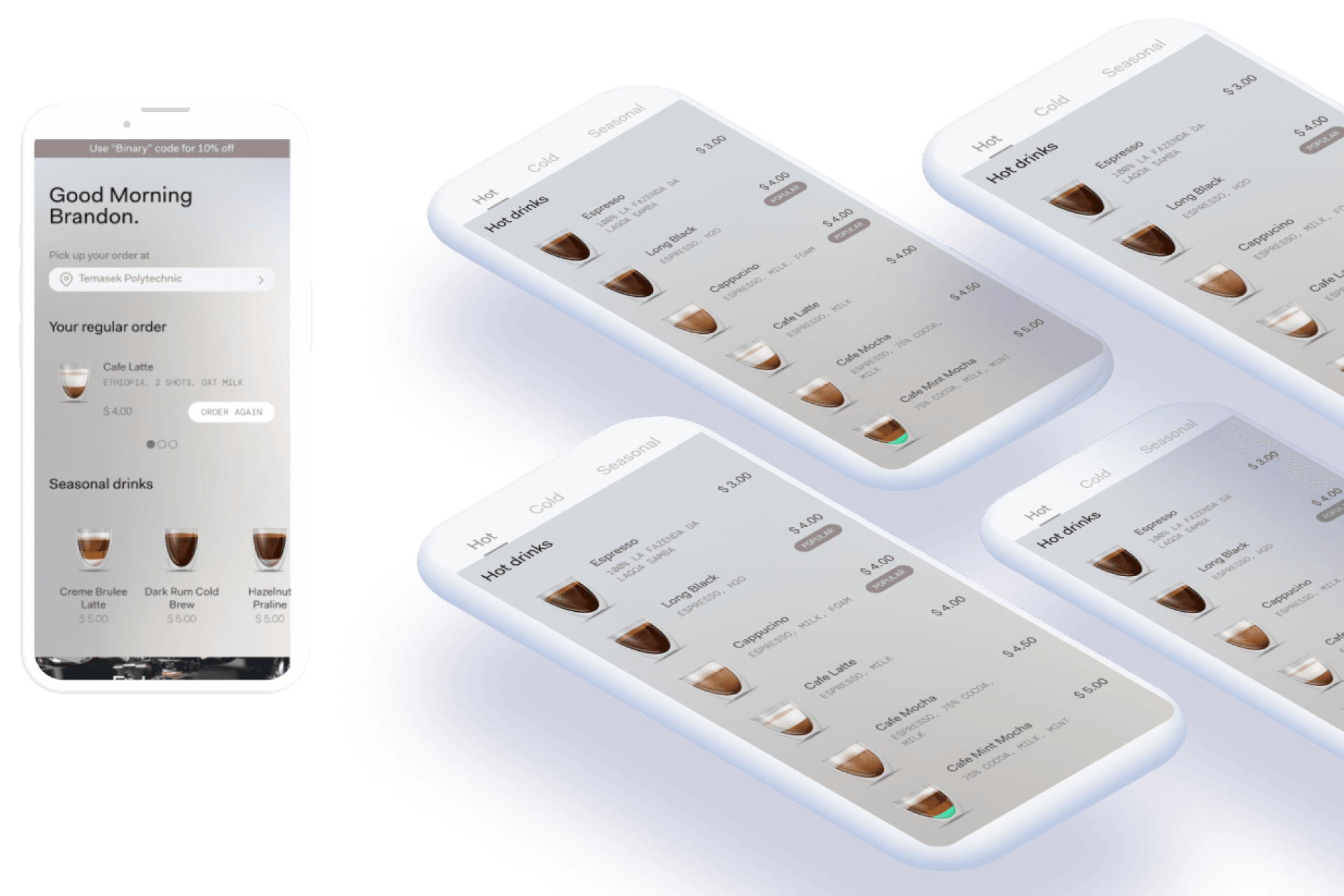

Final Design
➡️ Interact with the final prototype here


Learnings
As the project brief included an array of features and the timeline was only 2.5 weeks, it was a challenge for us to identify what the main features required to establish a minimum lovable product were. We overcame it by focusing on research where we first understood users’ needs in order to prioritise the essential features. This also ensured our process will not be bogged down by the need to incorporate everything.
Here are our key reflections and observations on the opportunities moving forward. We have shared these insights with Binary Coffee to help inform their possible next steps for their mobile app.:
The initial design, created by an external agency, was visually stunning but lacked the necessary accessibility features to ensure an optimal reading experience for all users on the platform. It became clear to me the importance of considering every aspect of design, particularly the critical need for accessibility.
Key Reflections
Balancing user needs & business needs in design decisions Users want to edit/cancel their preorders but it may cause high cancellation rate for businesses.
Different users exhibit different behaviours even when carrying out same task Some users changed location on the home screen while some changed location on the checkout screen after clicking on regular order first. It is important to create multiple pathways for users to perform a task.
Opportunities Moving Forward
Users are driven by incentives when providing feedback or creating an account → Next Steps: • Have a membership or loyalty program to incentivise returning customers • Tie in with a gifting feature or referral to expand the network effect
Users would like to preorder in advance or have a recurring order → Next Steps: • Tie in with the subscription feature • Consider adding in calendar feature where users can make recurring and multiple orders at one go
Special Thanks to
Liqin Ng
UX/UI Designer
Project Manager
Jasmint Tan
UX/UI Designer
User Interface Lead
Mandy Phang
UX/UI Designer
User Research Lead
Illustrations credits to Freepik
Overview
This was a pro bono client project, where I worked closely together with my coursemates in a team of 4. The goal was to create a mobile app that would provide a positive and customer-centric buying experience.
Our deliverables include personas, user journey maps, user flows, wireframes, usability test reports, and high-fidelity prototypes.
Problem
Binary Coffee wants to make specialty coffee accessible to everyone, anywhere. However, they currently do not have a mobile application available. Coffee orders are made via an existing kiosk machine. As the kiosk is completely self-service (operated by a robot barista), our project's challenge is to come up with a mobile application that enables customers to
01
Seamlessly order coffee and at the same time,
02
Enhance their knowledge for appreciation for coffee
03
In the absence of human interaction
Solution
We identified the following 3 focus areas that will help solve our challenge based on research user data and feedback.
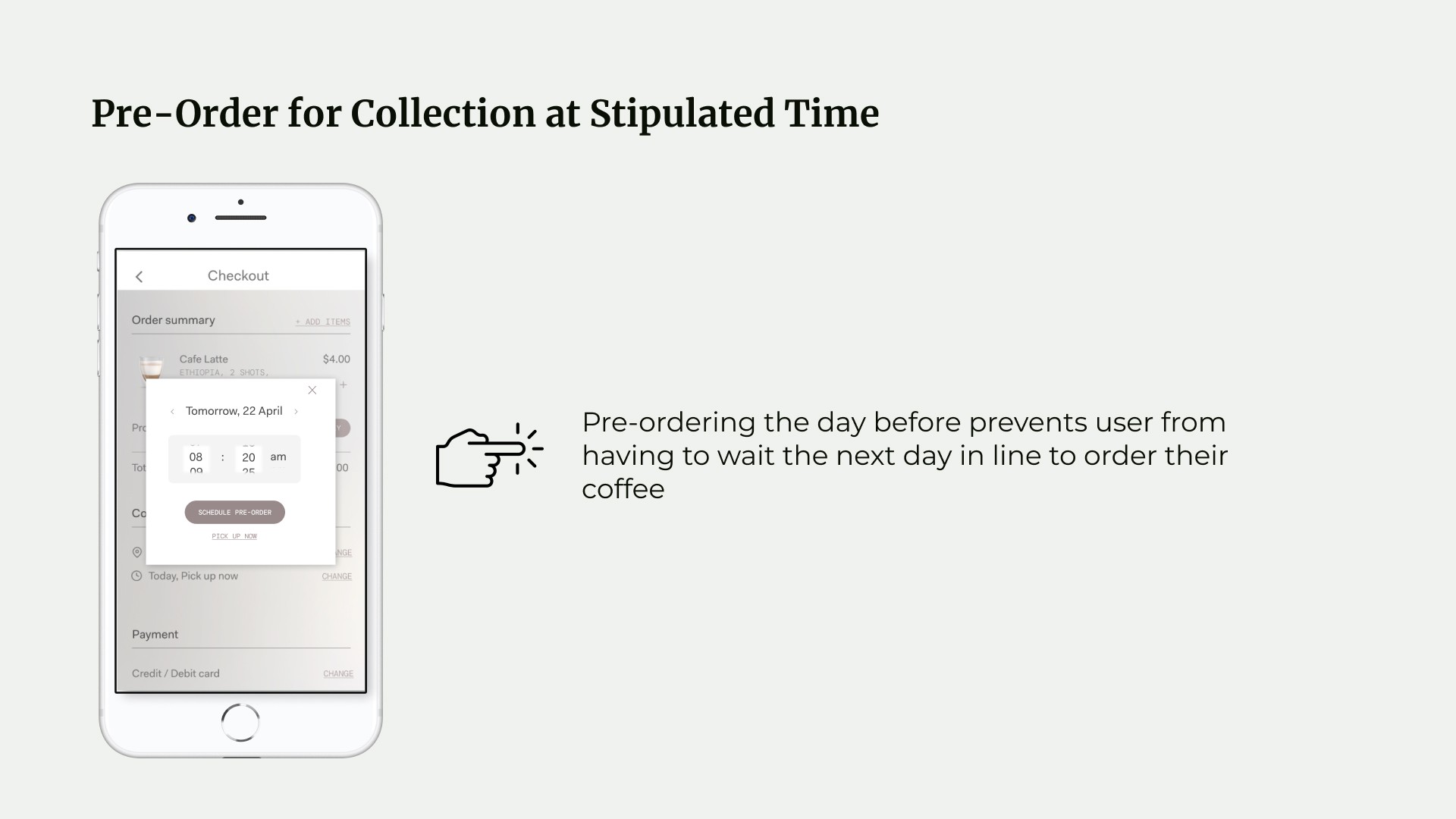
Pre-order for collection at stipulated timing — solves for (1) a seamless way to order

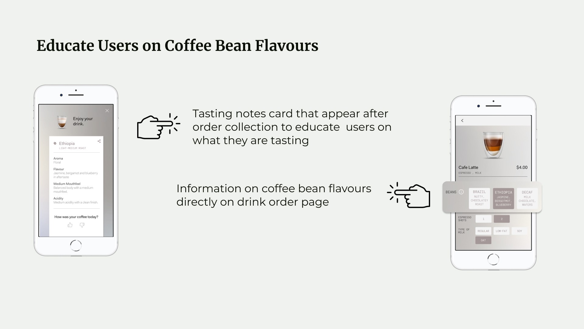
Educating users of coffee bean flavors — solves for (2) enhances their knowledge & appreciation for coffee

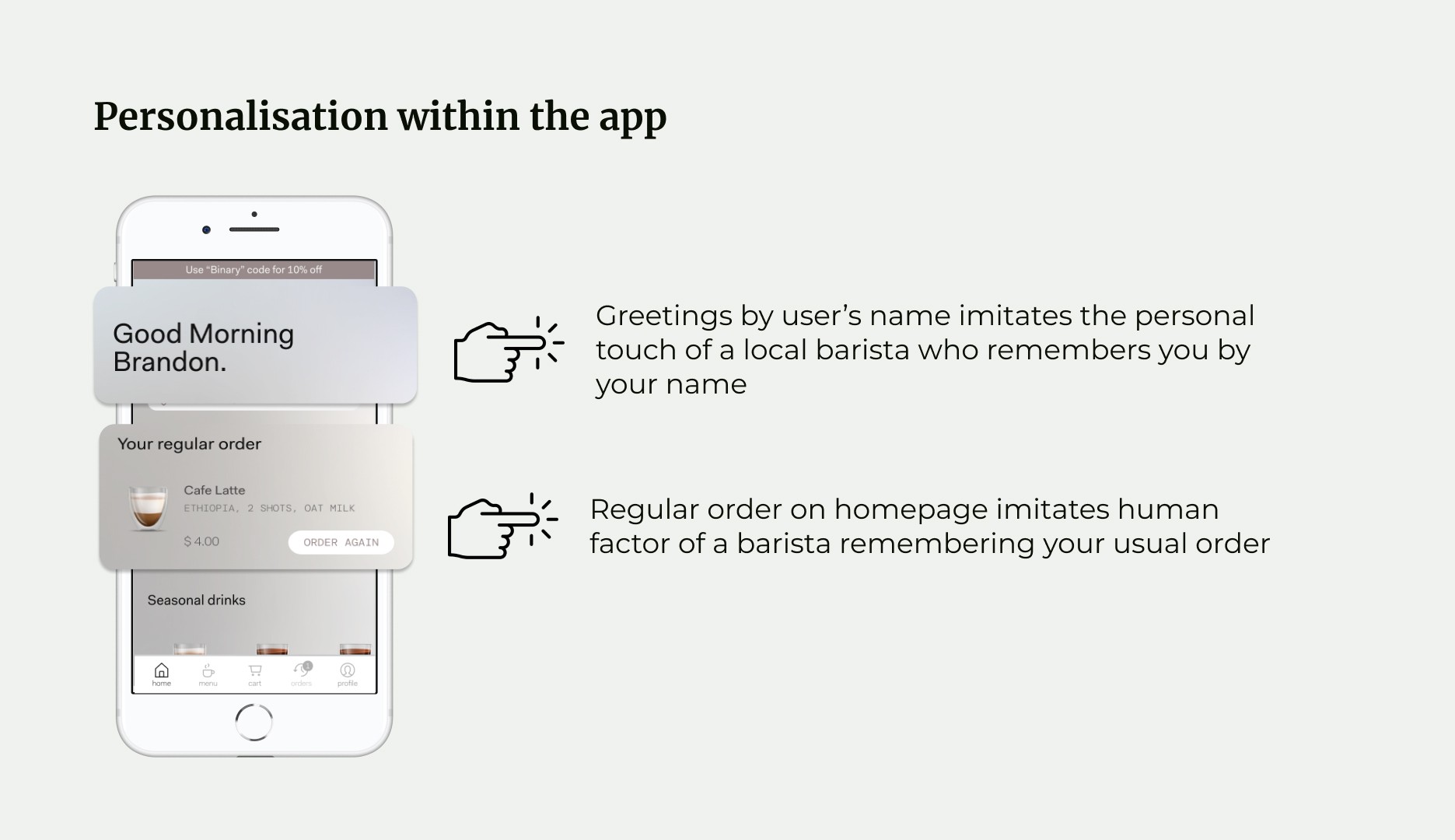
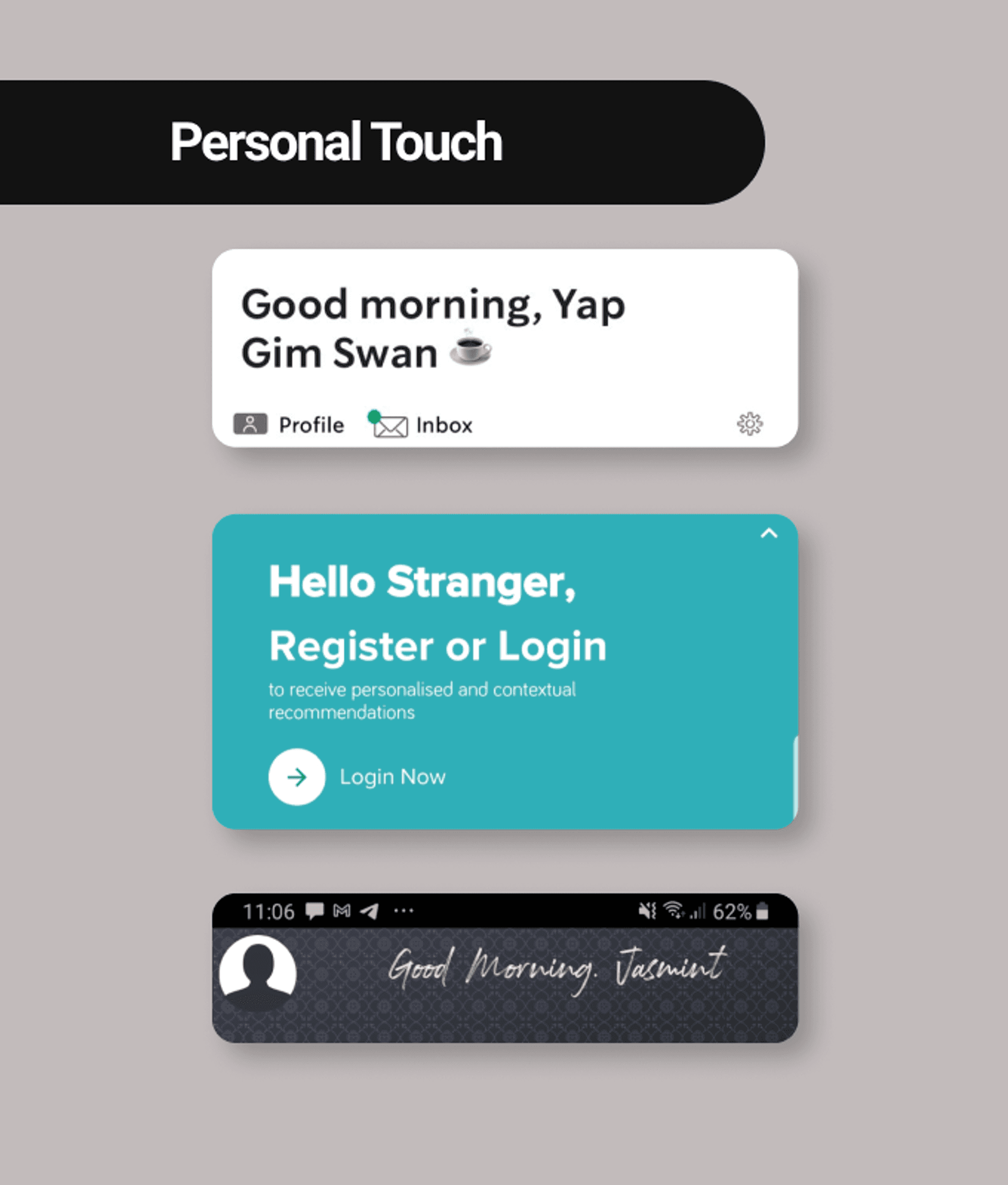
Personalisation within the app — solves for (3) the absence of human touch

Process
We utilised a two-pronged approach for research which was to benchmark against competitors (competitor analysis) and user research.
Competitor Analysis
We reviewed the mobile apps of the 6 following companies as part of our competitive and comparative analyses:
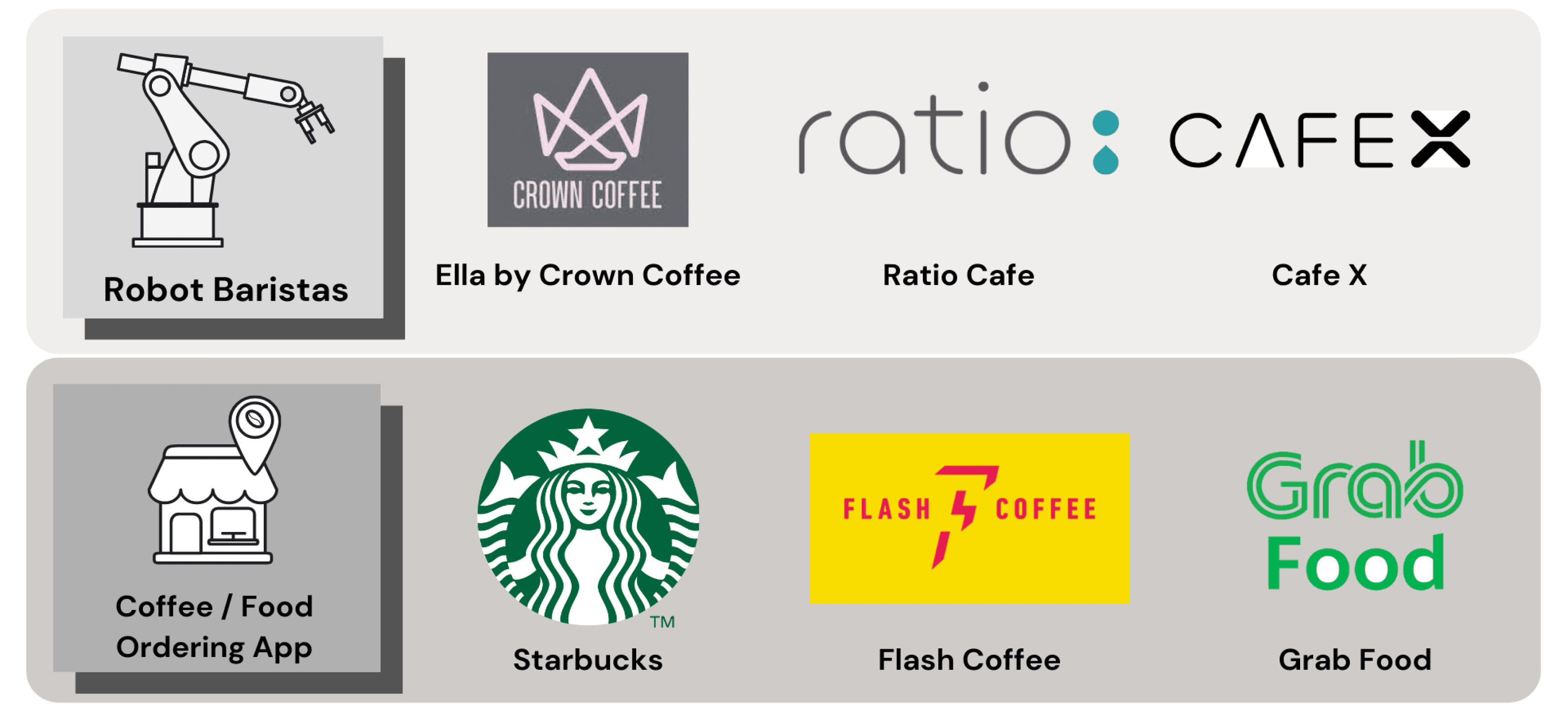

Robot Baristas & Direct Competitors for Competitive and Comparative analysis
Besides including other robot baristas in our analysis, we examined other direct competitors offering coffee beverages such as Starbucks, Flash coffee, and GrabFood to see where they have done well or areas where we can improve on our design.
The following methods were used for the analysis:
Pluses & Deltas to look at strong and weak areas of design
Tasks Analysis - to see user flow of making an order on other apps
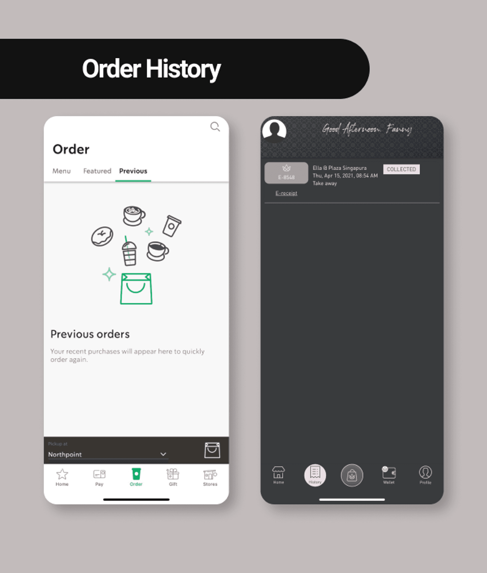
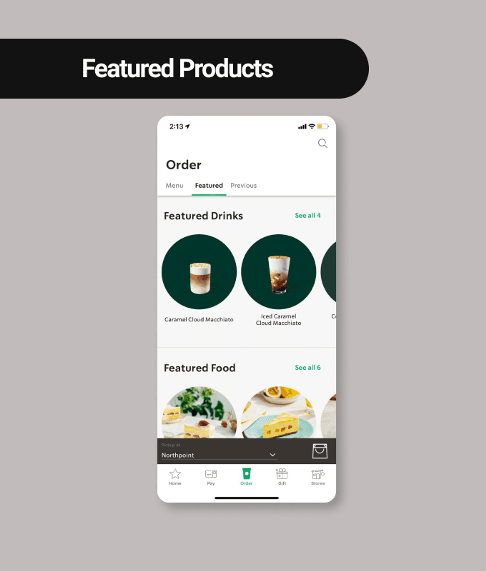
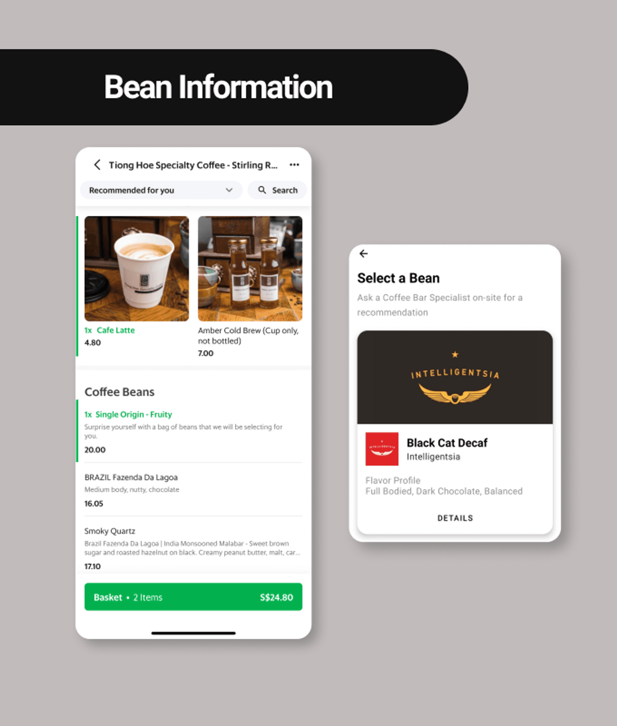
Based on our analyses, we identified the following design opportunities where they can address problems faced by the users:




User Research
We interviewed a total of 15 users who are regular coffee drinkers to learn more about their routine, drinking habits, and preferences. Two main insights stood out that align with the challenge of the project:
I want to know the origin, process & coffee profile
I don’t like to wait for my coffee


Insights from Affinity Mapping
It takes too long to wait for my coffee in the morning, so I’ll head to the one with the shortest queue
-28year old banker
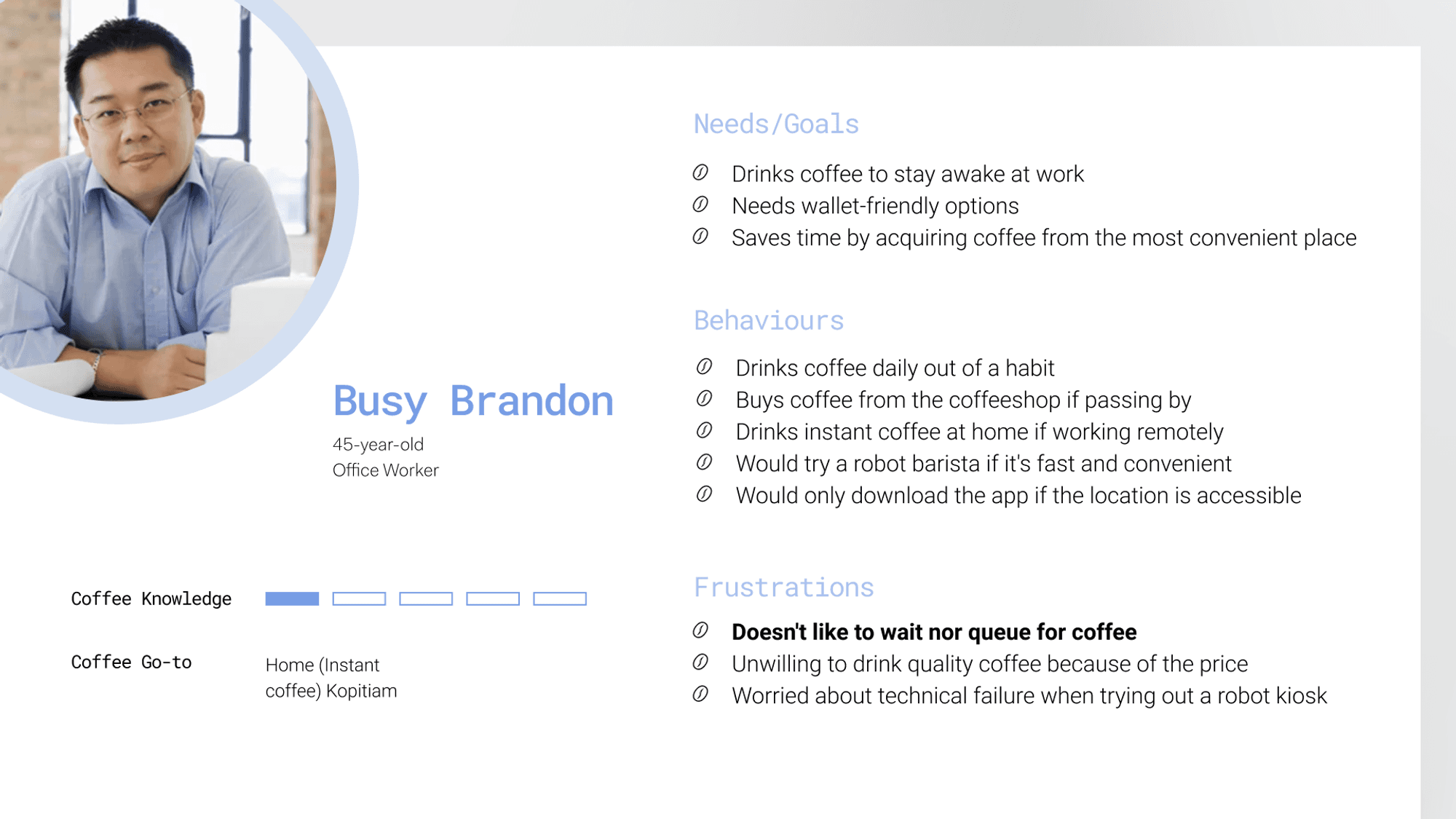
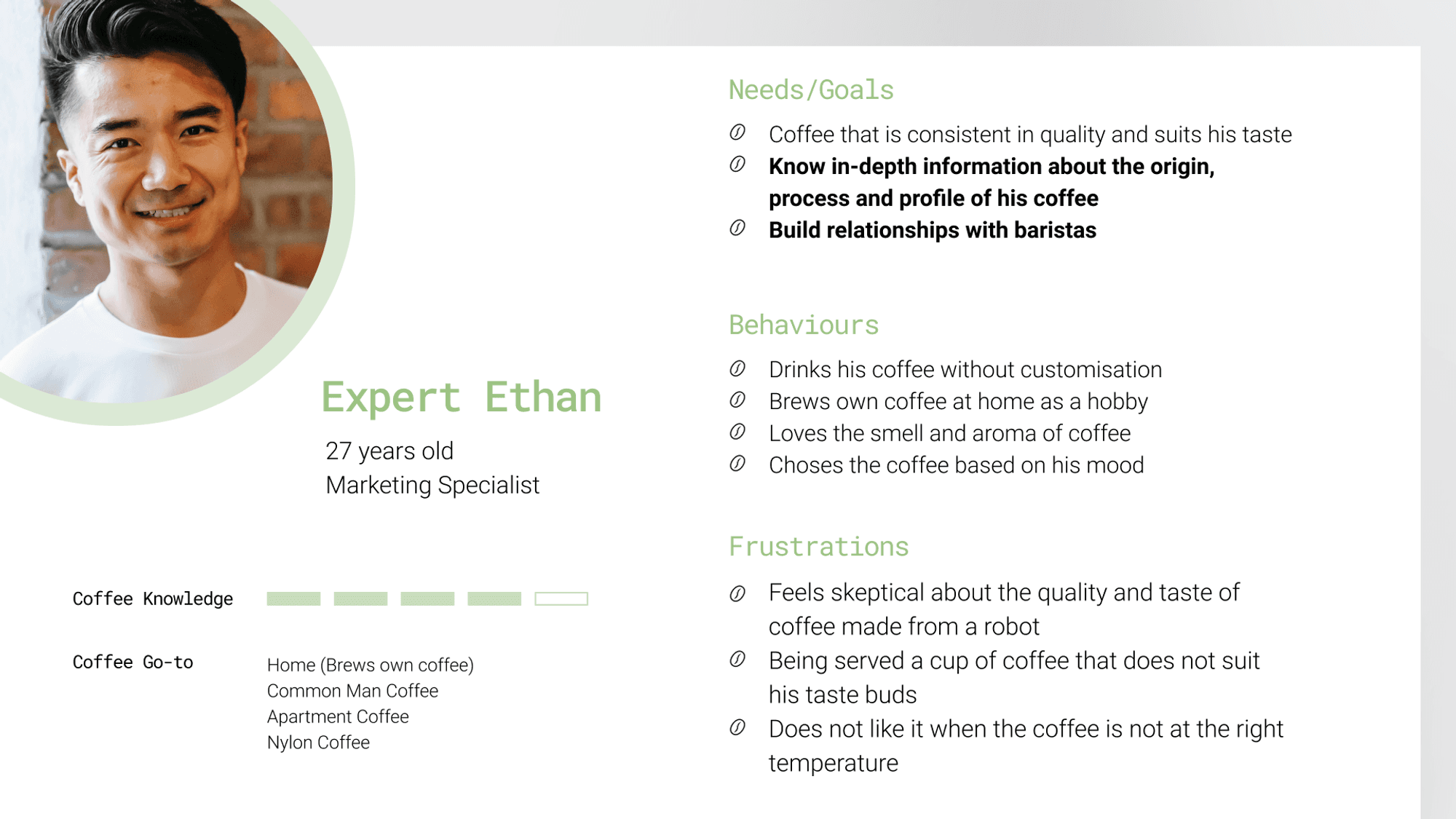
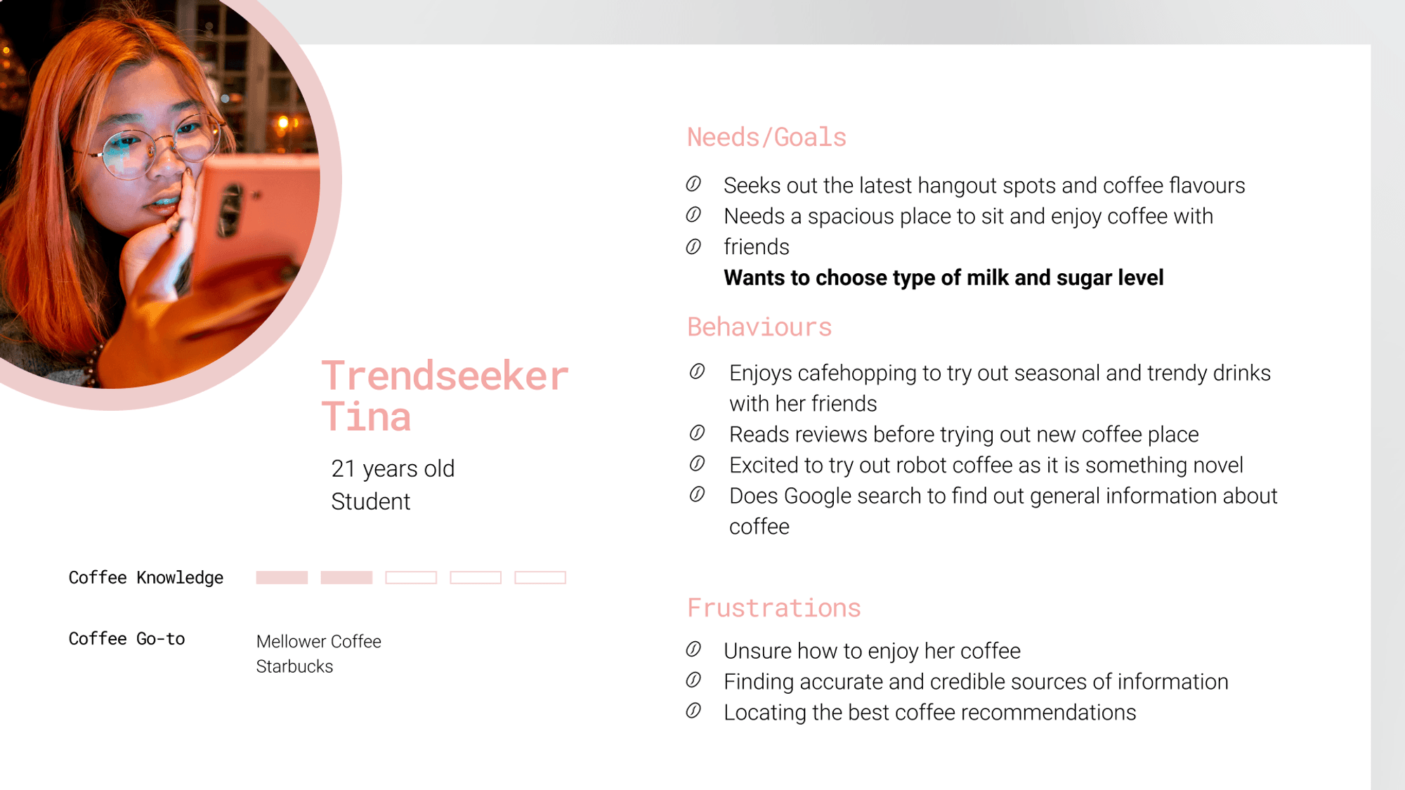
From the insights we’ve gathered, we formed the following 3 personas:




Problem
Coffee drinkers need accurate information about the coffee bean flavours and status of their order to better enjoy their cup of coffee suited to their lifestyle

Solution
By providing coffee drinkers with real-time and detailed information about their order, they will be able to confidently savour a preferred cup of coffee at their convenience.
User Flow
We conducted a design studio with our initial sketches and conducted it remotely with the use of the Miro. Here are the two proposed user flows that we came up with to resolve the problems:
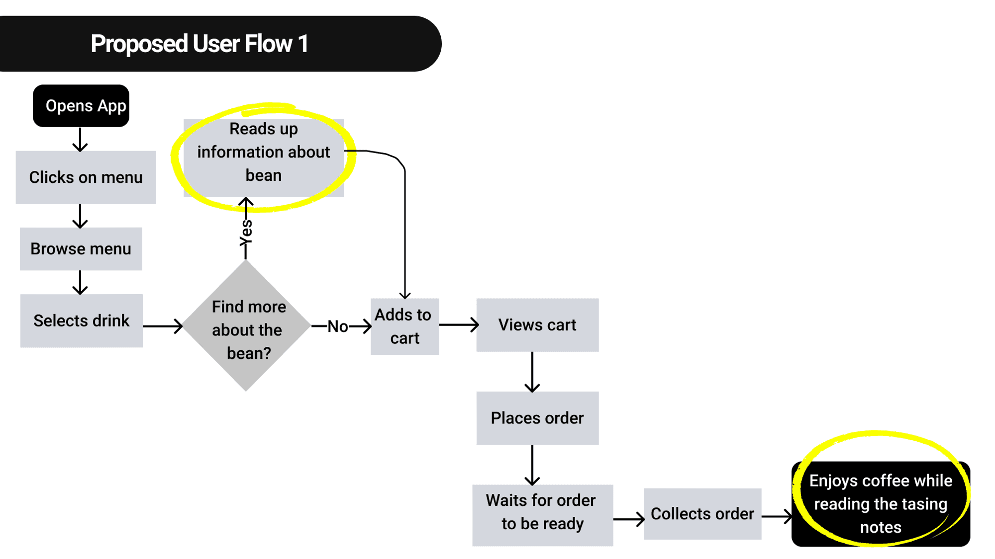

Highlighted touch points provides knowledge on coffee bean flavours
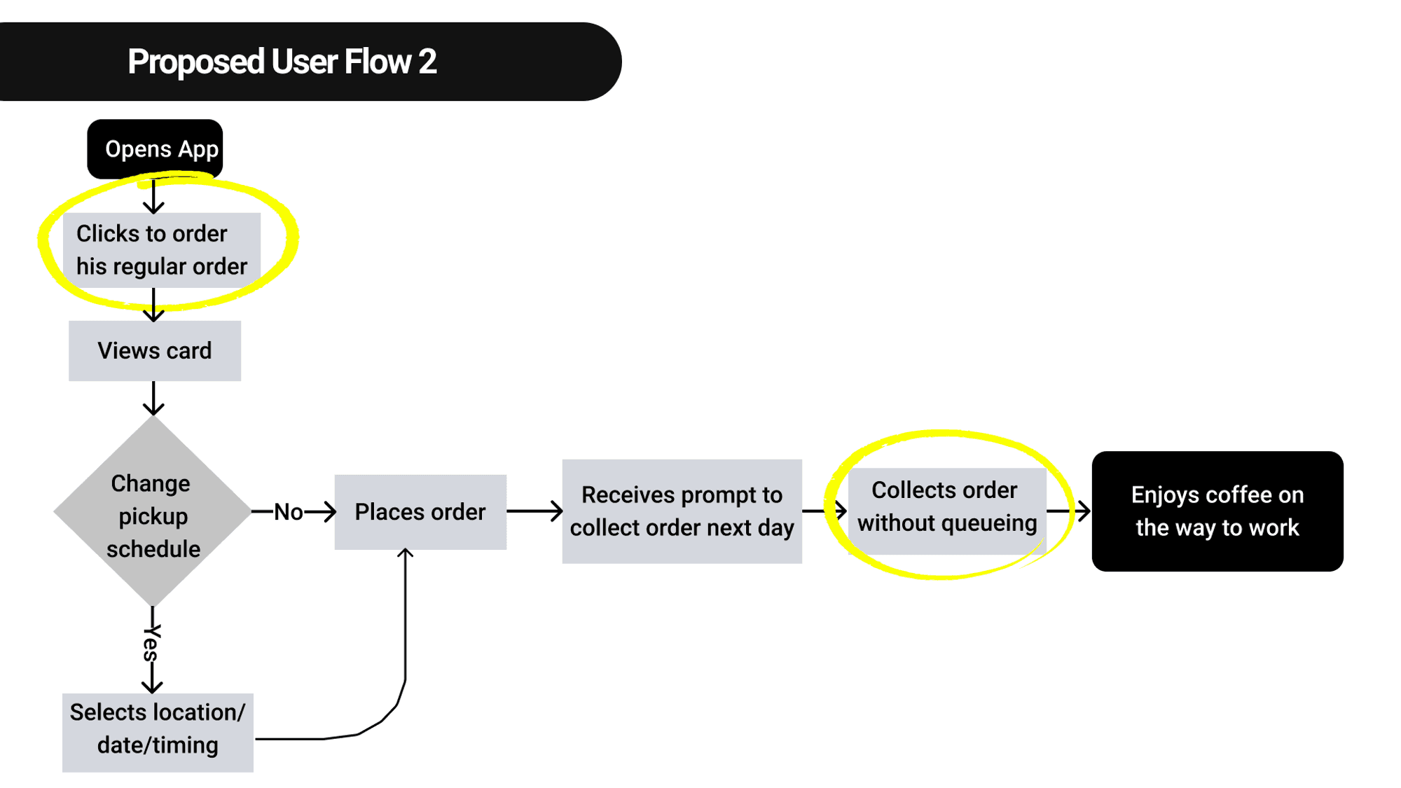

Highlighted touch points provides knowledge on coffee bean flavours
Usability Testings
The objectives of the tests were to:
Gain insights into user behaviours when ordering coffee
Investigate users’ perception of the coffee information provided
Identify any possible obstacles or confusion in coffee purchase or discovery
The first usability test was conducted on the lo-fi prototype, where we put 5 users to 2 tasks as shown below.
Task #1 Purchase a cup of normal hot latte with oat milk, and choose the type of coffee bean that is floral and fruity


Task #2 Make a quick pre-order of a usual drink, to be collected tomorrow 9.30 am at Somerset.


Major Design Iteration & Feedback
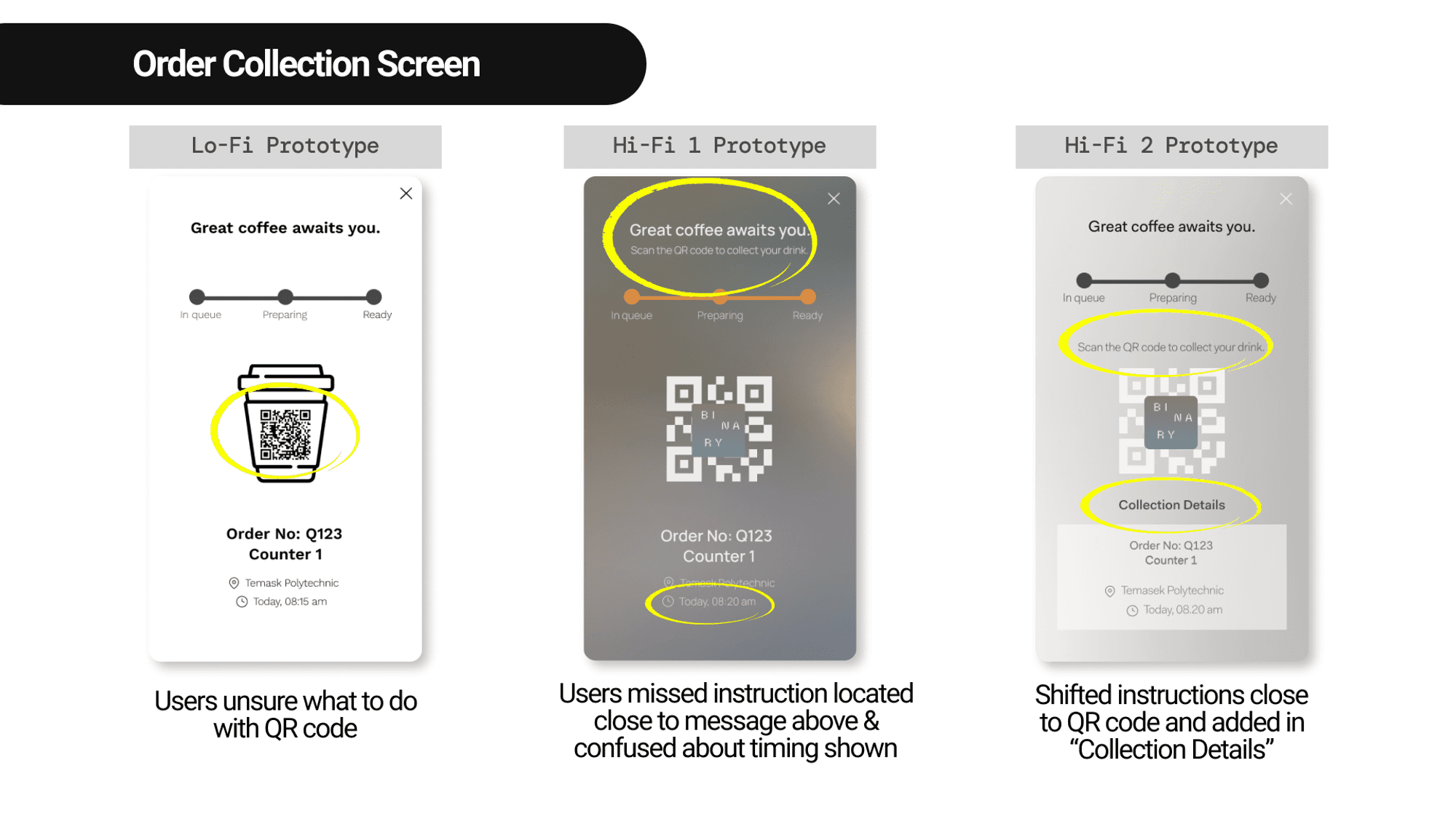
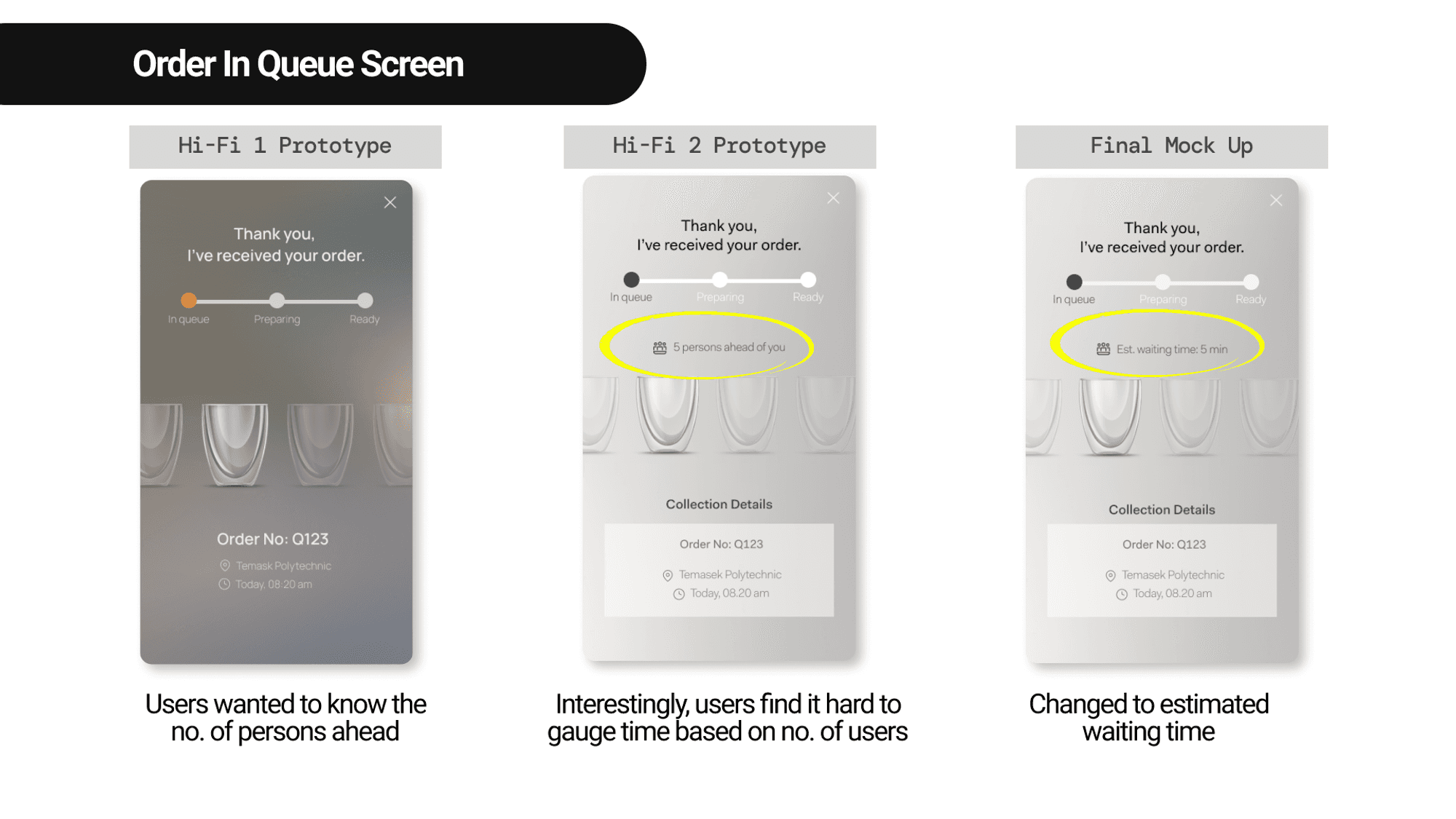
Main Issue #1: Users were confused during order tracking & collection
It was crucial to ensure no confusion occurs when it comes to collecting orders as there is no human barista/staff to call out for order collection or make any clarification on the spot.


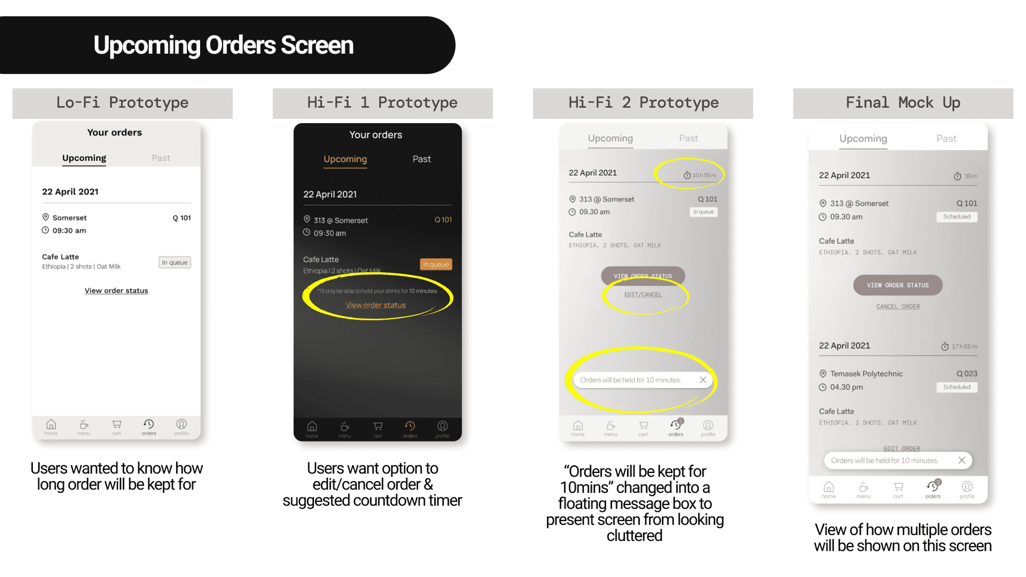
Main Issue #2: Users want assurance on their preorder
As pre-order are made in advance, providing accurate and detailed information on upcoming orders and the ability to change or edit orders will give users peace of mind to make the order. In consideration of operational constraint of cut off time for editing an order, the final mock-up shows how the interface will look like when it gets close to collection time.

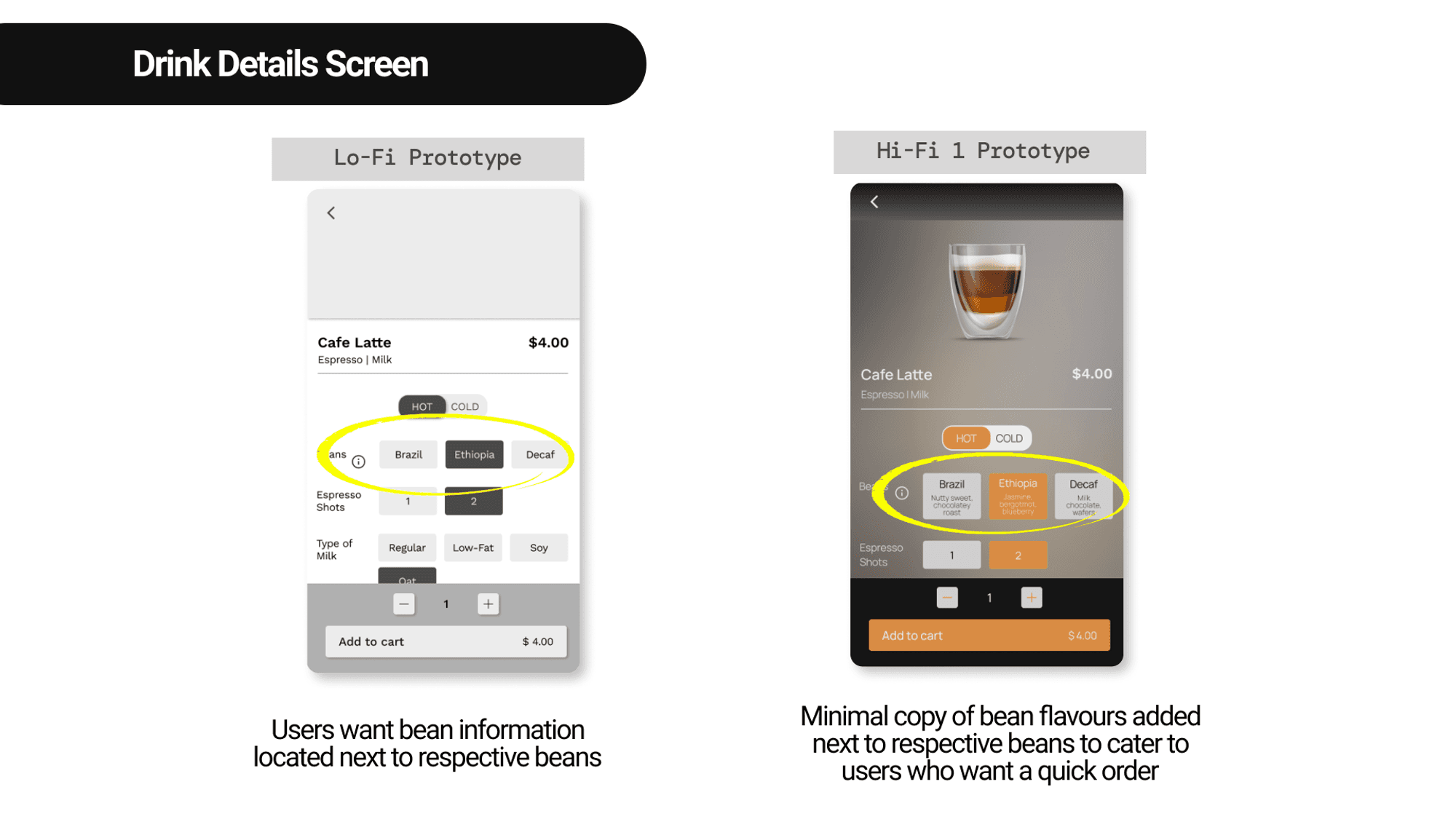
Main Issue #3: Users have different behaviors & preferences
Our application is catered to a wide group of audience, including expert drinkers who want to know about the coffee beans and busy workers who want a quick order of their daily caffeine fix. Hence, having the flavours stated underneath the respective beans, help inform the users quickly on which coffee bean to choose. Retaining the “i” button can allow people who wish to learn more, find out more information.

Binary Coffee Mobile App Design
Created Mobile App for a Robot Barista startup Self Serving Kiosk
Created Mobile App for a Robot Barista startup Self Serving Kiosk
My Role
My main role was to lead the usability testing and prototyping. I also conducted user research & competitive analysis.
Method
User research, user journey mapping, wireframing, prototyping and usability testing
Timeline
2.5 Weeks
Platform
Mobile
Let’s connect
Looking to collaborate on user-centered, business-driven design? Or simply want to exchange ideas & insights over a cup of ☕️ coffee?
I’d love to connect— feel free to reach out on Linkedin or via email!
Overview
This was a pro bono client project, where I worked closely together with my coursemates in a team of 4. The goal was to create a mobile app that would provide a positive and customer-centric buying experience.
Our deliverables include personas, user journey maps, user flows, wireframes, usability test reports, and high-fidelity prototypes.
Problem
Binary Coffee wants to make specialty coffee accessible to everyone, anywhere. However, they currently do not have a mobile application available. Coffee orders are made via an existing kiosk machine. As the kiosk is completely self-service (operated by a robot barista), our project's challenge is to come up with a mobile application that enables customers to
01
Seamlessly order coffee and at the same time,
02
Enhance their knowledge for appreciation for coffee,
03
In the absence of human interaction
Solution
We identified the following 3 focus areas that will help solve our challenge based on research user data and feedback.
Pre-order for collection at stipulated timing — solves for (1) a seamless way to order

Educating users of coffee bean flavors — solves for (2) enhances their knowledge & appreciation for coffee

Personalisation within the app — solves for (3) the absence of human touch

Research
We utilised a two-pronged approach for research which was to benchmark against competitors (competitor analysis) and user research.
Competitor Analysis
We reviewed the mobile apps of the 6 following companies as part of our competitive and comparative analyses:

Robot Baristas & Direct Competitors for Competitive and Comparative analysis
Besides including other robot baristas in our analysis, we examined other direct competitors offering coffee beverages such as Starbucks, Flash coffee, and GrabFood to see where they have done well or areas where we can improve on our design.
The following methods were used for the analysis:
Pluses & Deltas to look at strong and weak areas of design
Tasks Analysis - to see user flow of making an order on other apps
Based on our analyses, we identified the following design opportunities where they can address problems faced by the users:


User Research
We interviewed a total of 15 users who are regular coffee drinkers to learn more about their routine, drinking habits, and preferences. Two main insights stood out that align with the challenge of the project:
I want to know the origin, process & coffee profile
I don’t like to wait for my coffee

Insights from Affinity Mapping
It takes too long to wait for my coffee in the morning, so I’ll head to the one with the shortest queue
-28year old banker
From the insights we’ve gathered, we formed the following 3 personas:


Problem
Coffee drinkers need accurate information about the coffee bean flavours and status of their order to better enjoy their cup of coffee suited to their lifestyle

Solution
By providing coffee drinkers with real-time and detailed information about their order, they will be able to confidently savour a preferred cup of coffee at their convenience.
User Flow
We conducted a design studio with our initial sketches and conducted it remotely with the use of the Miro. Here are the two proposed user flows that we came up with to resolve the problems:

Highlighted touch points provides knowledge on coffee bean flavours

Highlighted touch points provides knowledge on coffee bean flavours
Testings and Major Design Iterations
Usability Testings
The objectives of the tests were to:
Gain insights into user behaviours when ordering coffee
Investigate users’ perception of the coffee information provided
Identify any possible obstacles or confusion in coffee purchase or discovery
The first usability test was conducted on the lo-fi prototype, where we put 5 users to 2 tasks as shown below.
Task #1 Purchase a cup of normal hot latte with oat milk, and choose the type of coffee bean that is floral and fruity

Task #2 Make a quick pre-order of a usual drink, to be collected tomorrow 9.30 am at Somerset.

Main Issue #1: Users were confused during order tracking & collection
It was crucial to ensure no confusion occurs when it comes to collecting orders as there is no human barista/staff to call out for order collection or make any clarification on the spot.


Main Issue #2: Users want assurance on their preorder
As pre-order are made in advance, providing accurate and detailed information on upcoming orders and the ability to change or edit orders will give users peace of mind to make the order. In consideration of operational constraint of cut off time for editing an order, the final mock-up shows how the interface will look like when it gets close to collection time.

Main Issue #3: Users have different behaviors & preferences
Our application is catered to a wide group of audience, including expert drinkers who want to know about the coffee beans and busy workers who want a quick order of their daily caffeine fix. Hence, having the flavours stated underneath the respective beans, help inform the users quickly on which coffee bean to choose. Retaining the “i” button can allow people who wish to learn more, find out more information.

Final Design
➡️ Interact with the final prototype here

Learnings
As the project brief included an array of features and the timeline was only 2.5 weeks, it was a challenge for us to identify what the main features required to establish a minimum lovable product were. We overcame it by focusing on research where we first understood users’ needs in order to prioritise the essential features. This also ensured our process will not be bogged down by the need to incorporate everything.
Here are our key reflections and observations on the opportunities moving forward. We have shared these insights with Binary Coffee to help inform their possible next steps for their mobile app.:
The initial design, created by an external agency, was visually stunning but lacked the necessary accessibility features to ensure an optimal reading experience for all users on the platform. It became clear to me the importance of considering every aspect of design, particularly the critical need for accessibility.
Key Reflections
Balancing user needs & business needs in design decisions Users want to edit/cancel their preorders but it may cause high cancellation rate for businesses.
Different users exhibit different behaviours even when carrying out same task Some users changed location on the home screen while some changed location on the checkout screen after clicking on regular order first. It is important to create multiple pathways for users to perform a task.
Opportunities Moving Forward
Users are driven by incentives when providing feedback or creating an account → Next Steps: • Have a membership or loyalty program to incentivise returning customers • Tie in with a gifting feature or referral to expand the network effect
Users would like to preorder in advance or have a recurring order → Next Steps: • Tie in with the subscription feature • Consider adding in calendar feature where users can make recurring and multiple orders at one go
Special Thanks to
Liqin Ng
UX/UI Designer
Project Manager
Jasmint Tan
UX/UI Designer
User Interface Lead
Mandy Phang
UX/UI Designer
User Research Lead
Illustrations credits to Freepik
Let’s connect
Looking to collaborate on user-centered, business-driven design? Or simply want to exchange ideas & insights over a cup of ☕️ coffee?
I’d love to connect— feel free to reach out on Linkedin or via email!